Certain colors signal wealth more effectively than others, and the science behind why has nothing to do with designer labels or price tags.
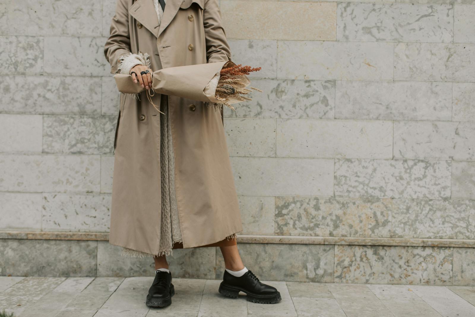
When a plant-based founder walks into a pitch meeting wearing a head-to-toe camel ensemble, the room reads competence before she opens her mouth. She isn't wearing a logo. She isn't wearing color. She's wearing a calibrated palette that signals seriousness without saying the word.
This matters more than it should for anyone advocating for sustainable choices. Fair or not, the credibility of plant-based and eco-conscious voices often gets filtered through how put-together they look. The cut matters. The fabric matters more. But color is what your audience registers first, before they've consciously read anything else about you.
Here's the catch: most of the colors that read as expensive are also the colors hardest to produce ethically. The deep, restrained shades that signal "quiet luxury" rely on dye processes that, done conventionally, are among the most polluting steps in the entire fashion supply chain. The UN Environment Programme has estimated that textile dyeing is the second-largest polluter of water globally, responsible for roughly 20 percent of industrial wastewater.
So this is a guide with two layers. What signals our eyes are actually reading, and how to opt into that visual vocabulary through plant-based dyes, low-impact processes, and brands that aren't dumping the cost into a river somewhere.
Why color reads as quality before anything else
Research on consumer perception of luxury and craft has consistently found that perceived value is shaped less by overt branding than by aesthetic restraint. Loud signals read as trying. Quiet signals read as having.
The same restraint principle applies to sustainable wardrobes. A capsule of well-dyed neutrals will out-perform a closet of trend pieces both visually and environmentally, because the garments stay in rotation longer. The Ellen MacArthur Foundation has documented that extending the active life of clothing by just nine months reduces its carbon, water, and waste footprint by around 20 to 30 percent each.
Your wardrobe is packaging. The rules transfer, and so do the consequences.
1. Camel
Camel is the color stylists name first, almost reflexively. It's the shade Max Mara built an empire on and the one The Row keeps returning to every season.
The reason camel reads expensive has less to do with the color itself and more to do with what cheap camel looks like: orange-tinted, flat, slightly plastic. Getting camel right requires good fabric, and the eye knows this.
The plant-based version is easier than you'd think. Undyed or minimally dyed camel-toned wool, alpaca, and organic cotton already sit in this range naturally, which means less dye load and less water impact. Brands like Eileen Fisher and Mara Hoffman regularly carry pieces in this palette using lower-impact processes.
2. Ivory (not white)
Bright optical white is a uniform color. It belongs to t-shirts, hotel linens, and lab coats.
Ivory is its older, wealthier cousin. Slightly warm, slightly creamy, it suggests the garment has been chosen rather than issued.
This distinction matters environmentally too. Optical white usually requires chlorine bleaching and optical brightening agents, both of which are rough on waterways. Ivory and natural off-whites can be achieved with undyed organic cotton, linen, or hemp, skipping the bleaching step entirely.
An undyed organic linen blouse will outperform a bleached cotton one in almost every assessment of both perceived quality and environmental cost.
3. Charcoal
Black is the obvious move. Charcoal is the better one.
True black is hard to keep looking true. It fades to a sad navy-grey after a few washes, and most affordable fabrics never had real depth to begin with. Charcoal hides the aging.
It also flatters more skin tones than black does, because it absorbs less light around the face and creates softer shadows.
From a sustainability angle, charcoal can be achieved through iron-mordanted plant dyes (logwood, walnut, and chestnut all produce deep charcoals) without the heavy metal salts and synthetic dye baths that conventional black requires. Look for brands using natural indigo overdyed with tannin-rich plant materials.
4. Navy
Navy is the color old money never stopped wearing.
It carries the formality of black without the funereal weight. It works in wool, in silk, in cotton, in linen. It survives bad lighting. It photographs beautifully.
The reason navy reads as expensive is partly cultural (it's the color of boarding schools, sailing clubs, and inherited blazers) and partly optical. Deep navy creates the same slimming effect as black but with more dimension.
Navy is also one of the great plant-based dye success stories. Real indigo, derived from the Indigofera plant, has been used for thousands of years and produces the deepest, most light-stable navies in the natural dye world. One indigo-dyed cashmere sweater will work harder than three trendier knits combined.
5. Chocolate brown
Brown spent two decades exiled from fashion. It came back hard around 2023 and hasn't left.
The reason chocolate brown reads expensive now is partly recency — it's current shorthand for fashion awareness — and partly because it's genuinely difficult to dye well. Cheap brown looks muddy. Good brown looks like espresso.
It's also the easiest color on this list to achieve with plant-based dyes. Walnut husks, chestnut, cutch, and even spent coffee grounds produce rich, complex browns that synthetic dyes struggle to match. The palette compounds: brown with camel, brown with ivory, brown with charcoal.
6. Sage or muted olive
The only green that consistently reads expensive is the one that looks like it's been left out in the sun for a season. Bright greens read as costume. Forest green can work but trends preppy. Sage and muted olive sit in the middle.
These shades work because they're hard to produce cheaply. The dye process for getting a sophisticated dusty green is finicky, and fast fashion versions usually overshoot into mint or undershoot into army surplus.
This is also where plant dyes have an edge. Weld, nettle, and birch leaves produce exactly the muted, slightly dusty greens that synthetic dyes tend to over-saturate. A 2021 review in the Journal of Cleaner Production found that natural dye applications in textiles consistently produce more nuanced, multi-tonal results than their synthetic counterparts, which is exactly the visual quality the eye reads as expensive.
7. Burgundy or oxblood
Red is loud. Burgundy is composed.
The deeper, wine-toned end of red carries all the visual interest of a bright shade without any of the attention-seeking. It's the color of leather-bound books, good wine, and Bottega Veneta accessories from approximately every fall collection.
Burgundy is also achievable through madder root, one of the oldest plant dyes in human use, capable of producing everything from rust to deep oxblood depending on the mordant. Burgundy works particularly well on accessories: a bag, a shoe, a belt. It adds dimension to a neutral outfit without breaking the palette, and it's the easiest color on this list to introduce if your current wardrobe skews toward black and grey.
What ties these seven together
None of them are bright. None of them are pure primaries. All of them sit slightly off the most obvious version of themselves: ivory instead of white, charcoal instead of black, chocolate instead of brown, burgundy instead of red.
That slightly-off quality is the entire trick. The eye reads precision as effort, and effort as resource.
It's also, conveniently, the exact tonal range where plant-based and low-impact dyes thrive. Natural dyes rarely produce neon. They almost always produce the muted, complex, slightly-off versions of colors that read as considered. The sustainable choice and the expensive-looking choice land in the same place.

The honest caveat
Looking expensive isn't the same as being expensive, and it isn't the same as being well-dressed. Plenty of beautifully dressed people wear coral and cobalt and lemon yellow and look incredible doing it.
The seven colors above aren't a moral category. They're a specific visual code with a specific cultural meaning attached, and that meaning is what's sometimes called quiet money. If that's the code you want to speak, this is the vocabulary.
If it isn't, ignore the list. Color that makes you feel like yourself will always read better than color that makes you look like someone else's idea of expensive.
The interesting question isn't whether to chase this aesthetic. It's why we've collectively decided that restraint reads as wealth in the first place, and what we can do with that knowledge as consumers. Research on consumer behavior around eco-conscious fashion suggests that buyers increasingly assign higher value to garments with transparent, lower-impact production stories, even before they know the price. The signal of restraint and the signal of sustainability are starting to converge.
Which means the quietest wardrobe in the room might also be the most defensible one. That's a status game worth playing.