Swap flimsy hardware, hang curtains to the floor, and the whole room levels up.
There’s a quiet confidence to truly refined homes.
Not loud. Not try-hard.
Just a series of small, intentional choices that add up to a space that feels finished.
Here are nine details that do the heavy lifting.
1. A foyer that sets the tone
First impressions matter. A thoughtful entry tells guests what to expect from the rest of your home.
I keep it simple: one statement light, a substantial mirror (eye level, not floating near the ceiling), and a slim console with a tray for keys.
Add a single, sculptural object—like a stone bowl or a ceramic piece—and you’ve got restraint with personality.
If you want the fastest upgrade, edit. Fewer jackets, one umbrella, one piece of art. Finish with a subtle signature scent near the door (reed diffuser or a candle you actually light).
When the entry feels calm and intentional, everything beyond reads “considered.”
2. Architectural trim that frames the room
If furniture is the outfit, millwork is the tailoring. Crisp baseboards, beefier door casings, and crown molding instantly make a room feel finished.
Even in a rental, you can fake the look: paint baseboards and doors in a satin finish a shade deeper than your walls to create contrast and depth.
Picture-frame molding or board-and-batten can elevate a plain wall without adding clutter. Keep profiles simple and proportional to ceiling height.
The point isn’t to show off—it’s to give the eye clean lines to follow so the room feels grounded.
I once lived in a small apartment with absolutely no trim. Installing tall baseboards and painting the doors a moody taupe transformed the place, and nothing else changed.
Same furniture, new bones.
3. Layered lighting with proper dimmers
Overhead glare is the enemy of atmosphere.
Upper-tier spaces use three layers: ambient (ceiling or cove), task (lamps, under-cabinet), and accent (sconces, picture lights).
The upgrade path: add dimmers, choose warm bulbs (2700–3000K), and spread light sources around the room.
I like symmetrical pairs—two lamps flanking a sofa or bed—to calm the composition. A picture light over artwork adds that gallery hush, even if the art is a thrift find you love.
Pro tip: in open-plan areas, put kitchen pendants and living room lamps on separate circuits so you can dial each zone independently.
Mood is management.
4. Substantial hardware and fixtures
You touch handles, faucets, and pulls every day. When they’re weighty and well-made, the entire room reads differently.
Swap hollow knobs for solid brass, nickel, or matte black in a finish that matches your home’s vibe. Aim for consistent metal tones across a room, or at least keep warm metals together and cool metals together.
If you mix, do it deliberately—think antique brass with black, not chrome with brass and copper fighting for attention.
One small test I do: close your eyes and feel the handle. If it feels flimsy or rattly, it’s dragging down the space.
Quality hardware is like good shoes—quietly doing most of the work.
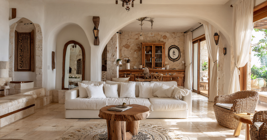
5. Window treatments that touch the floor
Nothing flattens a room faster than “floating” curtains.
Hang rods higher (just below the ceiling or crown) and wider than the window so panels frame glass rather than blocking it. Make sure drapes just “kiss” or slightly puddle on the floor—never hover.
Lined linen or a linen blend gives softness without the heavy hotel look. Roman shades in wovens or tailored fabric can layer under drapes for privacy and texture.
If you only do one thing, upgrade the rods and rings. A thin, bendy rod with tiny finials makes everything look temporary. A larger diameter rod with proper brackets says, “We meant this.”
I’ve mentioned this before but getting window scale right is the difference between “cute” and “considered.”
6. Natural materials and tactile contrast
Refined spaces lean on materials that age well: wood, stone, wool, leather, linen.
They photograph beautifully and they feel good in real life. That tactile quality is what signals “quiet luxury” far more than logos or labels.
Think contrast: a nubby wool rug under a smooth marble table, a linen sofa with a leather strap tray, a raked ceramic vase against a lacquered console.
Keep the palette tight—three to five colors total, with one accent at most—and vary the textures within that palette. This keeps the eye engaged without visual noise.
As someone who photographs interiors for fun, I can tell you natural textures make a room easier to shoot—and to live in. They diffuse light, hide minor wear, and create depth.
7. Art with scale and breathing room
High-end homes don’t clutter walls with too many small frames.
They choose fewer, larger pieces and give them space to breathe. One oversized canvas above the sofa beats a collage of undersized prints any day.
If large artwork isn’t in the budget, create scale with a grid of identical frames or a floor mirror leaning against the wall.
Hang art lower than you think. The center should hit around eye level for most people. And don’t be afraid of negative space—blank wall around a strong piece makes it feel intentional, not empty.
If you collect photography (guilty), try black or natural wood frames with wide mats. It reads gallery, not dorm room.
8. Built-ins and tailored storage
Clutter is loud. Built-ins whisper.
A simple run of bookshelves with a lower cabinet hides the necessary mess while putting a curated 30–40% of your favorite items on show: books you actually read, a few ceramics, a plant, maybe a framed photo with a story behind it.
Keep shelves varied by stacking some books horizontally, some vertically, and leaving negative space on at least a third of the shelves.
In smaller homes, “built-in” can be as simple as wall-mounting shallow cabinets and trimming them to look custom.
In entryways, a panel of hooks with a narrow bench feels bespoke when it’s the exact width of the wall. Tailoring equals polish.
I once turned an awkward alcove into a desk nook with wall shelves and a slab of oak. Cost less than a new chair. Looked like it came with the place.
9. One-of-a-kind pieces that add history
Upper-tier spaces rarely feel like a single online cart.
They mix eras and stories: an antique wood box on a modern coffee table, a vintage chair reupholstered in a crisp fabric, a hand-thrown vase next to a sleek lamp.
Even one “imperfect” piece can break up all the newness and make a room feel lived-in—in the best way.
I like to give every room a conversation object: the thing guests notice and ask about. It doesn’t need to be expensive.
A market find from your travels, a framed concert poster with personal meaning, a sculptural branch in a tall urn—anything with provenance or personality.
The trick is editing. Let that one piece shine rather than competing with five other “moments” in the same sightline.
How to pull it all together (without going overboard)
Start with structure (trim, lighting, window height), move to touchpoints (hardware, fabrics), then layer personality (art, objects).
Work one room at a time so choices stay consistent.
Use your phone camera as a truth-teller—if something reads busy or cheap on screen, it probably does in person, too.
And remember: elegance is more about subtraction than addition. When in doubt, remove one item, lower the art two inches, and dim the lights by 20%.
You’ll be surprised how often that’s the whole fix.
The bottom line
You don’t need a mansion to feel put-together.
You need intention.
Choose a few of these details, execute them cleanly, and let the quiet confidence do the rest.
Just launched: Laughing in the Face of Chaos by Rudá Iandê
Exhausted from trying to hold it all together?
You show up. You smile. You say the right things. But under the surface, something’s tightening. Maybe you don’t want to “stay positive” anymore. Maybe you’re done pretending everything’s fine.
This book is your permission slip to stop performing. To understand chaos at its root and all of your emotional layers.
In Laughing in the Face of Chaos, Brazilian shaman Rudá Iandê brings over 30 years of deep, one-on-one work helping people untangle from the roles they’ve been stuck in—so they can return to something real. He exposes the quiet pressure to be good, be successful, be spiritual—and shows how freedom often lives on the other side of that pressure.
This isn’t a book about becoming your best self. It’s about becoming your real self.
Related Stories from VegOut
- I thought my life was “fine” until I saw what joy actually looked like
- 9 things people who grew up in the 70s did on snow days that kids today will never replicate
- The conversation your adult children have had about you multiple times that they're waiting for the "right moment" to bring up—and why that moment keeps getting postponed