Ask yourself: Am I choosing this because I genuinely love it, or because I think it signals something about who I want to be?
Ever notice how certain color combinations just feel... off?
I'm not talking about bad taste in the traditional sense. I'm talking about those palette choices that subtly telegraph economic anxiety, the desperate desire to appear successful without the resources to pull it off naturally.
Here's what I've learned from years of observing design patterns and psychological triggers: color choices reveal more about our class background than we'd like to admit. And while I'm all for personal expression, understanding these signals can help you make more intentional decisions about how you present yourself and your space.
Let's talk about ten color choices that, to a trained eye, scream trying too hard.
1. Builder-grade beige paired with harsh white trim
You know the color I'm talking about. That flat, lifeless beige that developers slap on every surface because it's cheap and "neutral."
The problem isn't beige itself. It's the specific shade of builder-grade beige paired with stark white trim that creates this institutional vibe. It says "I haven't invested in personalizing this space" or worse, "I think this is what sophistication looks like."
I remember walking through a friend's new house when she was so proud of keeping the original paint. She thought she was being smart by not spending money on something that "looked fine." But that beige wasn't fine. It was the visual equivalent of giving up.
Real neutrals have depth, warmth, and complexity. They're chosen intentionally, not accepted by default.
2. Bright teal accent walls
Around 2010, someone decided that painting one wall in a vibrant teal or turquoise would add "personality" to a space. The trend caught fire in lower-income neighborhoods and never quite left.
Why does this read as economically anxious? Because it's design by committee and Pinterest board rather than genuine taste. It's the "I saw this in a magazine" approach to decorating, where you follow trends years after they've peaked in affluent circles.
The shade matters too. We're talking about that specific Caribbean blue that comes straight from the hardware store's "bold colors" section. Not the nuanced sea glass or muted sage that actually complements a space, but the saturated version that demands attention.
3. Tuscan yellow with terra cotta
This combination had its moment in the late 1990s and early 2000s when everyone wanted their suburban home to feel like an Italian villa. Spoiler alert: it didn't work then, and it definitely doesn't work now.
The issue is that this palette was mass-marketed as "Mediterranean elegance" to people who'd never been to the Mediterranean. It became shorthand for "I have taste" without requiring any actual taste.
As interior designer Nate Berkus has noted, "Your home should tell the story of who you are, and be a collection of what you love." Tuscan yellow rarely tells anyone's real story. It tells the story of what they think wealthy people's homes look like.
4. Purple and gold everything
Purple has long been associated with royalty, and that's precisely the problem. When people reach for purple paired with gold, they're often trying to broadcast luxury and status rather than create a cohesive aesthetic.
This shows up in everything from living room color schemes to wedding decor. The more someone insists on this combination, the more it signals aspiration rather than arrival.
True luxury whispers. It doesn't shout about itself in purple and gold.
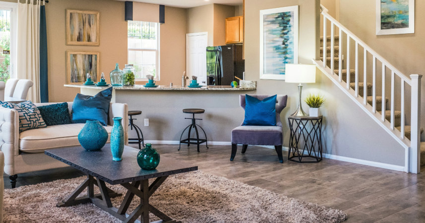
5. That specific shade of rental property gray
Gray became the "sophisticated" neutral of the 2010s, replacing beige in new construction and rental properties everywhere. But there's a difference between carefully selected grays with undertones that complement natural light, and that flat, lifeless gray that landlords choose because it's trendy and cheap.
You know the one. It's cold, it's institutional, and it makes every space feel like a corporate waiting room. It pairs with nothing because it has no depth or warmth.
I made this mistake myself in my first apartment after reading that gray was the "new neutral." I painted my bedroom in what I thought was a chic charcoal, only to realize it looked like a dentist's office. The lack of warmth made the space feel unwelcoming and cheap, no matter how nice my furniture was.
6. Red feature walls in dining areas
Red dining rooms became popular based on the idea that red stimulates appetite. But this literal interpretation of design psychology is exactly what gives it away.
Sophisticated design doesn't work from a checklist. It doesn't say "red goes in the dining room because a magazine said so." It considers the specific red, the lighting, the surrounding colors, and whether it actually works in that particular space.
The aggressive, primary red that shows up in so many dining rooms reads as formulaic rather than inspired. It's following rules instead of developing taste.
7. Bright white everything with chrome fixtures
There's a reason this look dominates flipped houses and budget renovations. It photographs well for listings, it's inexpensive to execute, and it tricks people into thinking they're seeing modern design.
But stark white with shiny chrome fixtures isn't modern. It's sterile.
The wealthy have moved on to warmer whites, mixed metals, and materials with actual texture and patina. The bright white and chrome combination now signals "flip" or "budget renovation" more than "high-end design."
8. Mauve and dusty rose with oak trim
This palette screams 1980s and early 1990s, which wouldn't be a problem if it was being used ironically or with intention. But it's not. It's still hanging around in homes where people haven't updated since then, can't afford to update, or think this dusty, dated look is somehow timeless.
Paired with that honey oak trim that was everywhere in the 80s and 90s, it creates a time capsule effect that immediately dates a space and its occupants' economic mobility.
Color trends evolve, and being stuck in a decades-old palette suggests being stuck in other ways too.
9. Lime green and hot pink combinations
This high-energy pairing shows up in children's rooms, budget hotels, and spaces where someone confused "bold" with "good."
The problem is the specific shades. We're talking about those fluorescent, crayon-box versions rather than sophisticated chartreuse or coral tones.
This combination typically appears in spaces where someone wanted to make an impact but didn't have the budget or knowledge to do it tastefully. It's the visual equivalent of shouting rather than speaking with confidence.
10. Chocolate brown and turquoise
This pairing was everywhere in the mid-2000s, marketed as sophisticated and modern. It showed up in bedding sets, bathroom towels, and living room accessories at every big box store.
And that's exactly the problem. When a color combination becomes a pre-packaged set at discount retailers, it stops being sophisticated. It becomes a signal that you're buying your aesthetic off the shelf rather than developing your own.
I've worked with clients who were genuinely confused about why their carefully coordinated brown and turquoise living room felt cheap despite spending decent money on furniture. The answer was simple: the color combination itself had become associated with mass-market design packages.
Moving forward
Look, I'm not here to shame anyone's color choices. We all start somewhere, and most of us don't have formal design training.
But understanding what colors signal can help you make more intentional choices. The goal isn't to follow some arbitrary rule about what's "classy." The goal is to develop your own eye and create spaces that feel authentic rather than aspirational.
Next time you're choosing paint colors or decorating, ask yourself: Am I choosing this because I genuinely love it, or because I think it signals something about who I want to be? The answer matters more than the specific shade.
And if you're feeling stuck or unsure, there's no shame in consulting with a color specialist or interior designer. A few hours of professional guidance can save you from years of living with choices that don't serve you.
If You Were a Healing Herb, Which Would You Be?
Each herb holds a unique kind of magic — soothing, awakening, grounding, or clarifying.
This 9-question quiz reveals the healing plant that mirrors your energy right now and what it says about your natural rhythm.
✨ Instant results. Deeply insightful.

Avery White
Formerly a financial analyst, Avery translates complex research into clear, informative narratives. Her evidence-based approach provides readers with reliable insights, presented with clarity and warmth. Outside of work, Avery enjoys trail running, gardening, and volunteering at local farmers’ markets.
More Articles by Avery