Color should lift your rooms, not fight them. If a shade makes your space feel smaller, harsher, or oddly dated, that’s your nudge.
We don’t talk enough about how color does the heavy lifting in a room.
It sets the mood, messes with scale, and—if you pick the wrong shade—can make an otherwise lovely space feel cramped and a little… bargain bin.
I’m not here to police your taste.
If you adore a color, you get to keep it.
But if your goal is a home that feels open, considered, and quietly elevated, these are six shades that often backfire—and what to try instead.
1) Bright white
I know. White feels safe.
But the ultra-stark, blue-leaning white (the kind that looks like printer paper or a rental repaint) can make rooms feel smaller and cheaper for two reasons.
First, it flattens everything. Without depth or undertone, walls read like blank poster board, which throws every drywall seam and texture into the spotlight. The eye has nothing to settle on, so spaces feel harsh instead of airy.
Second, cool whites bounce blue light in ways that make furnishings look off. Woods can skew orange. Skin tones go sallow. Art loses warmth. The result? More “office fluorescent” than “calm gallery.”
What works better: a soft white with a gentle undertone tailored to your light—creamy in north light, a subtle warm white in east/west light, and a very pale greige in intense south light. Look for paint with a mid-to-high Light Reflectance Value (LRV) but not all the way to 90+. You want glow, not glare. And keep sheen matte or eggshell on walls so you’re not spotlighting imperfections.
2) Builder beige
You can picture it: that pinky-beige from countless rentals and flip homes.
It was once the default because it hides dirt and “goes with everything.” In reality, it clashes with almost everything—especially modern finishes, cool stone, and gray upholstery. The pink undertone makes whites look dingy and turns your space into a time capsule from 2008.
Why it shrinks a room: muddy beiges absorb light without adding character. They read dusty, not cozy. And when your walls and floors are nearly the same value (lightness/darkness), the room turns into a monochrome blob with no depth cues. The eye can’t distinguish planes, so the space feels tighter.
What works better: greige (a balanced gray-beige) with a green or taupe undertone, or a light putty. These neutrals play nicely with warm and cool elements, which adds perceived quality. If you love warmth, try a pale camel or oat tone and layer textures—linen, boucle, wood—so the space looks intentional, not default.
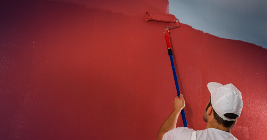
3) Cherry red
Red is fabulous in lipstick and sports cars. On four walls? It’s bossy.
Highly saturated red bounces around the room, tinting everything in its path. It also compresses space because warm wavelengths advance toward the eye. That “closing in” effect can be fun in a moody dining nook, but in most living rooms and bedrooms it feels loud and dated. And cheaper, because loud colors reveal uneven application and make trim cut-lines look messy.
There’s also a practical bit: red casts against skin and food. That means odd selfies and weird-looking meals—two small but constant reminders that the color is running the show.
What works better: if you crave warmth and drama, reach for browned reds (terra cotta, brick, cinnamon) at lower saturation, or corals with a hefty dose of gray. These give you the energy of red with sophistication and breathability. Use pure red as an accent: a lacquered console, a rug border, a lampshade. Ten percent red beats 100 percent red, every time.
4) Tuscan yellow
Remember the faux-finish, goldenrod era? The one with grapevine stencils and heavy scrollwork? That yellow pulls rooms into the past and makes them feel smaller by over-warming the light. It’s the paint equivalent of putting an orange Instagram filter over your house.
Yellow reflects like crazy. A strong, brown-based yellow will tint ceilings, floors, and fabrics, collapsing the subtle contrast that makes rooms read larger. It also cheapens stone and tile—especially anything with cool veining—by turning them muddied and mismatched.
What works better: buttery pales and muted wheat tones with a touch of gray. You get the sunshine without the scorch. Or try a creamy white elsewhere and bring yellow in via art, flowers, or patterned textiles—things you can swap seasonally. If you love Mediterranean warmth, consider soft clay, sand, and chalky off-whites, layered with natural woods and woven pieces.
5) Jet black
I love black—in fashion, typography, and small, high-contrast moments at home.
But full-coverage, jet-black walls in small or low-light rooms often make the space feel like a closet. The idea is moody chic; the reality can be dust magnets that show every scuff and shrink the footprint. If your trim and doors aren’t pristine, the effect skews DIY instead of designed.
Black also eats light. Unless you have abundant daylight and big scale (tall ceilings, generous windows, strong architectural bones), you end up compensating with lots of artificial lighting. More lamps can be cozy; more glare rarely is.
What works better: charcoal softened with green or brown, deep ink blue, or a soft black that’s technically an almost-black. These nuanced darks create atmosphere without the cave. And instead of painting every surface, consider contrast: dark on one architectural feature (a fireplace, built-ins) with lighter adjoining walls. High-quality matte paint elevates the look—cheap matte can burnish and look patchy.
6) Muddy olive
Earthy greens are “in,” but not all of them help a room. The army-drab, grayish-olive that looks chic on a field jacket can read sad on a living room wall—especially under LED bulbs with cool temperatures. It takes the life out of wood tones and can make white trim look dirty instead of crisp.
Why it shrinks and cheapens: too-murky greens lower the visual ceiling and cast a greenish tint over everything (including skin). They also tend to be applied in rooms that already lack natural light—so the gloom multiplies.
What works better: nature-true greens that lean slightly fresh (sage with silver undertones, eucalyptus, laurel) or richer olive lifted with yellow or gold (think green-tinged khaki rather than army). Pair with warm whites, brass, and natural textures so the palette reads layered and intentional.
A few color rules that make any room feel bigger and more considered
Test with intent.
Paint large swatches on poster board, move them around, and look morning, noon, and night. Light temperature changes undertones. That buttery yellow can turn “school bus” after 6 p.m.
Mind LRV.
Light Reflectance Value tells you how much light a color bounces. Higher isn’t always better. Aim for a mix: light walls for airiness, mid-tone upholstery for depth, darker grounding elements (rugs, side tables) for stability.
Control sheen.
High sheen = more reflection and more wall flaws. Eggshell or matte on walls, satin or semi-gloss for trim and doors. Consistent sheens read more expensive.
Limit the rainbow.
Use the 60/30/10 idea: one dominant neutral (60), a supportive secondary color (30), and a confident accent (10). Too many competing colors make a room feel busy, which our brains interpret as smaller.
Coordinate undertones.
Match warm with warm, cool with cool. If your floors are orange oak, bring in neutrals with a touch of warmth (greige, creamy white) rather than steely grays, which can clash and make everything look off.
Layer texture, not just color.
When you keep the palette restrained, texture does the luxury work: nubby linens, matte ceramics, unlacquered metals, boucle, wool rugs. Texture adds depth without visual clutter.
Light like a grown-up.
One ceiling light isn’t a lighting plan. Use three types: ambient (overhead), task (reading lamps), and accent (picture lights, sconces). Warmer bulbs (2700–3000K) are kinder to skin and fabrics, and they make most paint colors feel more expensive.
Use black sparingly for polish.
Even if you avoid jet-black walls, a few hits of black—frames, a lamp, cabinet hardware—will sharpen the palette and make lighter colors feel intentional.
Your color swap cheat sheet
- Bright white → soft white, pale greige, or warm off-white.
- Builder beige → balanced greige, putty, or light oat.
- Cherry red → browned terracotta, coral-gray, or brick accent.
- Tuscan yellow → muted wheat, straw, or creamy white + yellow accents.
- Jet black → soft black/charcoal/ink on features, not all four walls.
- Muddy olive → sage/eucalyptus/laurel with clear undertones.
Final thought
Color should lift your rooms, not fight them.
If a shade makes your space feel smaller, harsher, or oddly dated, that’s your nudge. Start with samples, pay attention to light, and let texture do the heavy lifting.
And if you truly love one of these “problem” colors? Keep it—just use it smarter. A lacquered side table here, a patterned pillow there. The goal isn’t to paint like everyone else. It’s to make your home feel like the best version of itself, not a smaller, cheaper one.