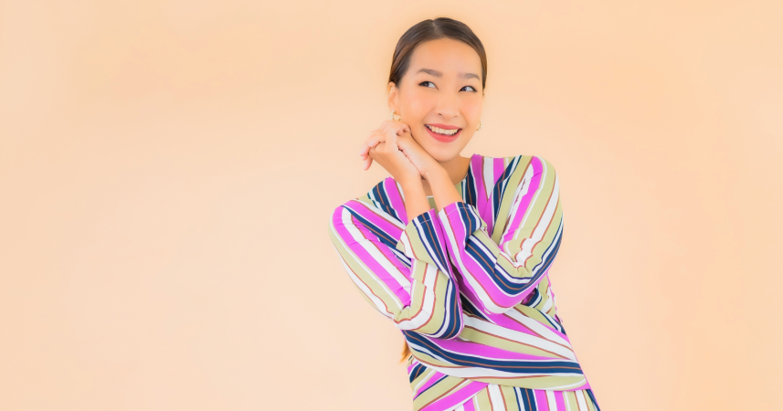
Colors don’t just decorate us—they influence mood, confidence, and even the way people respond before we speak.
![]()
Add VegOut to your Google News feed. ![]()
Fashion may not define us, but it sure does communicate something before we even say a word.
And here’s the kicker: you don’t have to be a trend-chaser to look current—you just need to avoid the subtle missteps that unintentionally age your look.
Color plays a huge role here. Some combinations feel timeless and polished, while others send signals of being stuck in the past. Think of it like choosing a font for a presentation—some fonts scream authority, others scream “I made this in 1999.”
I’ve learned the hard way that our color choices matter more than we realize. There was a time when I thought I was being bold with pairings, only to see photos later and cringe at how dated it all looked. And here’s the thing—once you see it, you can’t unsee it.
Ready to refine your palette? Let’s talk about seven color pairings that often look more outdated than elegant—and what to do instead.
1) Black and brown
Do you remember being told these two don’t go together? That was a rule people clung to for years. Ironically, the way it was enforced left us with dated-looking outfits: flat black pants with dull brown shoes or an almost-forced handbag pairing.
The problem isn’t that the colors clash. It’s that, without careful styling, they look flat and uninspired. The pairing often comes across as an afterthought rather than a deliberate choice.
But here’s the twist—when styled intentionally, black and brown can actually look modern. Think rich chocolate leather boots against sleek black jeans, finished with a gold chain or belt. The trick is contrast and texture, not just color.
If you’re aiming for elegance, though, brown pairs beautifully with camel or cream for a warm, soft look. Black, on the other hand, thrives when set against white, jewel tones, or even metallic accents. Those combinations say “timeless,” not “tired.”
2) Navy and black
Navy and black used to be considered the “safe” corporate combo. A navy skirt with a black blazer was practically a uniform in some offices. The problem? Safety often reads as uninspired.
When paired, these two dark shades blur into each other. Instead of looking cohesive, they compete for attention and end up dulling the overall effect.
Psychologically, both colors are associated with authority and formality. But together, that energy feels heavy rather than elegant.
If you want to modernize navy, try white for a crisp nautical vibe. Navy and emerald green can look rich and stylish. Even a pop of rust or mustard against navy feels fresh. Black, on the other hand, already dominates many wardrobes—give it a more dramatic partner like red, cobalt, or metallics.
One of my favorite pairings? Navy trousers with a camel blazer. It feels professional without being predictable—and always gets compliments.
3) Red and green
Unless it’s December, this combination instantly brings holiday cheer—whether you want it to or not. Our brains are wired to make cultural associations, and this one is nearly impossible to shake.
I once wore a deep red blouse with hunter-green trousers to a September event, thinking the richness of the colors would read sophisticated. Instead, I spent the day answering jokes about Christmas parties.
The good news? Red and green can work if you tweak the shades. A muted sage green with burgundy feels chic and unexpected. A poppy red with pale mint looks playful and modern. The key is avoiding the saturated, pine-and-berry version that screams “holiday card.”
So, if you love these colors, don’t ditch them—just choose softer, dustier tones or mix them with neutrals to tone down the holiday vibe.
4) Purple and yellow
On the color wheel, these are perfect opposites—complementary colors that should, in theory, balance each other out. In practice, though, they often clash in ways that feel cartoonish.
Why? Because they’re both bold personalities. Purple is rich and regal, while yellow is energetic and cheerful. Put them side by side, and they fight for the spotlight. That’s why this combo often reminds people of sports uniforms or comic book characters.
A more elegant approach is to let one color dominate while the other whispers. A plum dress with delicate gold earrings? Gorgeous. A mustard sweater with soft lavender accents? Playful without being loud.
The psychological balance matters too. Gold jewelry, for example, softens purple’s heaviness. Lavender paired with beige feels light and contemporary. By toning down the contrast, you move the look from garish to graceful.
5) Pastels layered together
Pastels have their place—they can feel fresh, romantic, and approachable. But when you stack pastel pink, baby blue, and mint all in one outfit, it can veer into “Easter egg basket” territory.
The problem is that pastels are low in saturation. Too many together lack depth, so the outfit loses its grounding. Instead of elegance, it feels whimsical or even childlike.
The fix is simple: anchor a pastel with a neutral or a stronger color. A blush blouse with charcoal trousers looks sharp. Powder blue with tan accessories feels refined. Even pairing lavender with olive green can create a sophisticated contrast.
Think of pastels as accents, not the main event. When grounded properly, they look grown-up and chic instead of sugary.
6) Bright pink and black
This pairing had its golden era in the early 2000s. Hot pink against black screamed rebellious, edgy, maybe even a little punk. The issue? That cultural moment has passed. Today, it reads as dated rather than daring.
I still laugh when I see old photos of myself in neon pink tanks with black skinny jeans. Back then, I felt stylish. Now, it’s giving “mall fashion 2005.”
The harshness of jet black next to fluorescent pink is what makes the combo feel stuck in time. If you love pink, update it with different partners. Fuchsia with navy feels bold and modern. Soft blush with camel is elegant. Even a bubblegum pink sweater with light gray trousers feels playful without being trapped in the past.
The key is pairing pink with tones that elevate it instead of exaggerating its intensity.
7) Burgundy and hunter green
On their own, both colors are rich, deep, and lovely. Together, though? They immediately evoke the heavy interior design trends of the 1980s and 1990s. Think velvet drapes, floral couches, and dark wood paneling.
It’s not that burgundy and green can’t ever mix. It’s that their heaviness, when combined, creates a retro effect. Instead of refined, it feels nostalgic—and not in the chic, vintage way.
To modernize burgundy, try pairing it with blush, dove gray, or even ivory. Hunter green looks gorgeous with cream, gold, or rust tones. Each gets to shine on its own instead of dragging each other into a time capsule.
Why this matters more than you think
It’s easy to brush off clothing as “just clothes.” But psychology shows us that color strongly influences perception—not just how others see us, but how we see ourselves.
When you wear outdated combinations, you might unintentionally signal that you’re holding onto an old version of yourself. That doesn’t mean you need to chase every fashion trend, but it does mean being mindful of the messages you send through color.
I think back to my years in finance. Numbers told one story, but how you presented them told another. An elegant report didn’t just communicate data—it communicated competence. Your wardrobe does the same. The way you pair colors is another form of presentation, one that quietly shapes how others interpret you.
Quick swap guide: outdated vs. modern
Here’s a cheat sheet for making quick updates:
-
Black + brown → Brown with cream or camel; black with jewel tones.
-
Navy + black → Navy with camel, emerald, or crisp white.
-
Red + green → Sage with burgundy, or red with mint.
-
Purple + yellow → Plum with gold; mustard with lavender.
-
Pastel overload → One pastel anchored with gray, tan, or olive.
-
Bright pink + black → Fuchsia with navy; blush with camel.
-
Burgundy + hunter green → Burgundy with blush or gray; hunter green with cream or rust.
Final thoughts
Elegance isn’t about expensive clothes or chasing new trends. It’s about awareness—knowing what feels intentional and what feels outdated.
If you’ve been clinging to some of these combos out of habit, this is your reminder that small tweaks can go a long way. Swap a shoe, change a blazer, add a grounding neutral. It doesn’t require a complete wardrobe overhaul to look refreshed.
The goal isn’t perfection. It’s alignment. When your colors work in harmony, you signal that you’re present, thoughtful, and confident.
And that’s a message that never goes out of style.