Some colors make everyone look radiant and expensive, while others make even the most beautiful people look tired and washed out.
![]()
Add VegOut to your Google News feed. ![]()
I used to think certain colors just weren't "my colors."
Then I realized the problem wasn't me. It was that I was wearing the wrong shades of those colors. Or wearing colors that genuinely don't work on anyone, regardless of skin tone.
Here's what I've learned after years of trial and error (and way too many bad outfit photos): some colors are universally flattering. They make everyone look healthier, more polished, more put-together. Other colors are universally difficult, making even the most beautiful people look washed out or sallow.
Understanding which is which changed how I shop and how I feel in my clothes.
Let's start with the winners:
8 colors that flatter every skin tone
1. Blush pink
This might surprise you, but blush pink works on everyone.
I'm not talking about bubblegum or hot pink. I'm talking about that soft, muted, slightly dusty pink. The color of rose petals or a sunset.
Blush pink brings warmth to your complexion without overwhelming it. It's feminine without being juvenile, soft without being weak. On deeper skin tones, it creates this beautiful contrast. On lighter skin tones, it adds warmth and life.
I was skeptical about this until I tried it. Now it's one of my go-to colors for looking effortlessly polished.
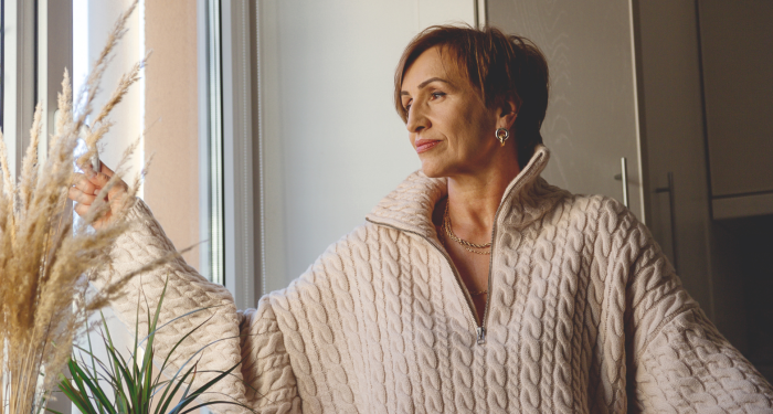
2. Ivory
Pure white can be harsh and unforgiving. Ivory is white's sophisticated, more flattering cousin.
Ivory has just enough warmth to complement every skin tone without the starkness of bright white. It softens your features instead of creating harsh contrast.
This color makes you look expensive and elegant without trying. It works in casual outfits, professional settings, formal events. It's versatile in a way that bright white never is.
The key is finding true ivory, not cream or off-white. Ivory has that subtle warmth that makes all the difference.
3. Camel
Camel is one of those colors that looks expensive on everyone. It's that rich, warm tan. Think camel coats, neutral separates, classic pieces that never go out of style. This color has depth and sophistication that lighter beiges lack.
Camel works because it's neutral enough to be versatile but warm enough to be flattering. It complements both warm and cool undertones. It makes your skin look healthier and more radiant.
Every wardrobe needs camel. It's a neutral that actually enhances rather than just existing.
4. Charcoal gray
Forget boring gray. Charcoal gray is where it's at.
This deep, rich gray is dark enough to be slimming and sophisticated, but softer than black. It doesn't wash anyone out the way lighter grays can.
Charcoal works across all skin tones because it provides contrast without being harsh. It's professional without being boring, elegant without being stuffy.
Plus, it goes with everything. Charcoal is the neutral that makes you look like you have your life together.
5. Chocolate brown
Rich, deep chocolate brown is criminally underrated.
This isn't that muddy medium brown. This is deep, luxurious, almost-black brown. It's warm, sophisticated, and incredibly flattering on every skin tone.
Chocolate brown brings out warmth in your complexion and makes your eyes pop, so it photographs beautifully. And it feels more approachable than black while being equally chic.
I wear chocolate brown when I want to look polished but not severe. It's become one of my wardrobe staples.
6. Teal
You wouldn't think teal can be universally flattering, but it is. As that perfect middle ground between blue and green, it's magic on every skin tone.
The blue undertones keep it cool and fresh. The green undertones add warmth and depth. The result is a color that somehow complements everyone.
Teal makes your eyes brighter, your skin clearer, your whole appearance more vibrant. It's bold without being loud, colorful without being overwhelming.
Whether you go for deep teal or brighter shades, this color consistently works.
7. Plum/eggplant
Deep purple tones are universally flattering in a way that lighter purples aren't.
Plum and eggplant bring richness and sophistication to any outfit. They're jewel tones that enhance your natural coloring rather than competing with it.
These shades work particularly well near your face. They make your skin look brighter and more even-toned. They add depth and interest without being too bold.
8. True red
Not orange-red. Not burgundy. True red with blue undertones.
This is the classic red lipstick shade in clothing form. It's bold, confident, and flattering on absolutely everyone.
True red provides contrast against any skin tone. It makes you look vibrant and alive. It's the color that makes people remember you.
The key is avoiding reds with orange or brown undertones, which can be tricky. True red with that slight blue undertone is universally gorgeous.
6 colors that don't flatter most skin tones
Now for the difficult ones. These colors can work in specific contexts or shades, but generally, they're challenging on everyone.
1. Neon yellow
There's a reason you don't see neon yellow often outside of safety vests. This color reflects light in a way that makes everyone look jaundiced. It brings out yellow undertones in your skin, dark circles under your eyes, and generally makes you look unwell.
Even people with the most beautiful complexions struggle with neon yellow. It's just too harsh and unflattering.
2. Orange
Pure orange is one of the most difficult colors to wear.
It's not burnt orange or terracotta, which can be beautiful. It's that bright, true orange that makes most people look washed out or sallow.
Orange reflects onto your skin in unflattering ways. It emphasizes redness, brings out uneven tones, and generally doesn't do anyone any favors.
There are exceptions, but they're rare, so to be on the safe side, best to skip orange.
3. Certain shades of brown (muddy/beige tones)
Not all browns are created equal.
While chocolate brown is universally flattering, muddy browns and certain beiges make everyone look tired and dull. These are the colors that blend too much with your skin tone rather than complementing it.
If a brown looks like it's the exact same color as your skin (but duller), skip it. You want contrast and depth, not camouflage.
4. Gray-based pastels
Pastels can be tricky, but gray-based pastels are particularly challenging.
Colors like dusty lavender, gray-blue, or muted mint often make people look washed out. They lack the vibrancy to brighten your complexion and the depth to provide flattering contrast.
If you love pastels, go for warmer or brighter versions rather than these muted, grayish tones.
5. Bright white
Bright white is harsh on almost everyone. It creates too much contrast, reflects light unflatingly, and makes imperfections more visible. It's particularly difficult in clothing near your face.
This is why ivory exists. All the elegance of white without the harshness. Swap bright white for ivory and watch your outfits instantly become more flattering.
6. Olive green
Olive green is that muddy, yellowish green that makes most people look sickly.
It's not forest green or emerald, which can be gorgeous. It's that drab, military-inspired olive that drains color from your face and emphasizes any yellow or sallow undertones.
Even people who look good in most colors struggle with olive green. It's just not a friend to most complexions.
Final thoughts
Understanding color isn't about following strict rules or limiting your options. It's about knowing which colors enhance your natural beauty and which ones work against you.
The universally flattering colors make you look healthier, more polished, more vibrant. The difficult colors require extra effort and specific styling to pull off.
When you're building a wardrobe or shopping for key pieces, stick with the winners. These are the colors that will make you feel confident every time you wear them.
And those difficult colors? You don't need to avoid them completely, especially if you really love them. But maybe don't make them the star of your outfit. Use them as small accents if you truly adore them, but let the flattering colors do the heavy lifting.
Your clothes should enhance you, not compete with you. Choose colors that work with your natural beauty rather than against it.
What’s Your Plant-Powered Archetype?
Ever wonder what your everyday habits say about your deeper purpose—and how they ripple out to impact the planet?
This 90-second quiz reveals the plant-powered role you’re here to play, and the tiny shift that makes it even more powerful.
12 fun questions. Instant results. Surprisingly accurate.