The colors you pair together say more about you than you might think, and these combinations never miss.
I was standing in front of my closet last week, staring at a sea of individual pieces that somehow refused to come together. You know that feeling? Everything looks fine on its own, but when you try to create an outfit, something just feels off.
Then Marcus looked over and said, "Why don't you try that olive jacket with your rust-colored shirt?" I'd never considered putting those two colors together. But the moment I did, something clicked. The whole outfit suddenly felt intentional, modern, pulled-together in a way my usual combinations never quite achieved.
That got me thinking about color theory and how certain combinations just work, regardless of trends or age. As someone who spent years analyzing patterns in financial data, I've become fascinated by the patterns in what makes us feel confident and authentic in how we present ourselves to the world.
Rachel Zoe said it perfectly: "Style is a way to say who you are without having to speak." And honestly, after leaving my finance career where I wore the same monotonous suits for nearly two decades, I've been on a journey to figure out what I'm actually trying to say.
Here are seven color pairings that consistently elevate any look, no matter your age or personal style.
1) Navy and camel
This combination has staying power for a reason. There's something effortlessly sophisticated about pairing a deep navy with warm camel or tan tones.
What I love about this pairing is its versatility. A navy sweater with camel pants works for a farmers' market morning just as well as it does for a coffee meeting. The contrast is strong enough to be interesting but subtle enough to never feel loud or attention-seeking.
The warmth of camel softens navy's formality, while navy grounds camel's casual ease. Together, they create this balanced, pulled-together effect that reads as intentional without trying too hard.
2) Black and cream
Forget black and white. The real magic happens when you pair black with cream or off-white instead.
The softer contrast creates visual interest without the harsh divide of pure white. It's sophisticated and modern, with just enough warmth to keep it from feeling stark. I reach for this combination constantly when I'm writing and want to feel focused but not rigid.
Vanessa Friedman, the fashion critic, notes: "You do not want anything to distract from the strength and power of your ideas." This pairing embodies that philosophy. It's clean and clear, letting you be the focus rather than your clothes.
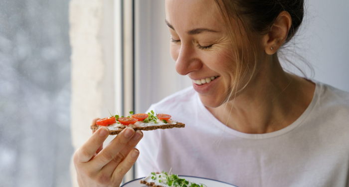
3) Olive green and rust
This is the combination Marcus suggested that opened my eyes to how colors can surprise you.
Both are earth tones, but they bring out unexpected depth in each other. The coolness of olive makes rust feel richer, while rust's warmth prevents olive from looking muddy or drab. Together, they create this organic, grounded aesthetic that feels very now.
As someone who spends a lot of time on trails and in my garden, these colors feel like an extension of the natural world I love. They work beautifully with the vegan lifestyle I've embraced, too, complementing the whole-foods-plant-based aesthetic without being overly literal about it.
4) Charcoal grey and blush pink
Had you told my 30-year-old financial analyst self that I'd one day advocate for wearing pink, I would have laughed. But this pairing changed my mind.
The key is using charcoal rather than lighter grey, and blush rather than bright pink. The combination strikes this perfect balance between strength and softness. It's professional without being stuffy, feminine without being precious.
What surprised me most about this pairing is how it challenges the either-or thinking I spent years trapped in. You don't have to choose between looking serious and looking approachable. Colors can hold both truths at once.
5) Forest green and burgundy
Rich, deep, and unmistakably autumnal, but these colors work year-round when you choose the right weights and textures.
There's an inherent elegance to this combination. Both colors have weight and presence without shouting for attention. They feel mature in the best sense, like they've earned their place in your wardrobe rather than just following whatever's trending.
I recently re-read Rudá Iandê's book Laughing in the Face of Chaos (I've mentioned it before, but his insights keep revealing new layers), and one line really stuck with me about authenticity:
"Most of us don't even know who we truly are. We wear masks so often, mold ourselves so thoroughly to fit societal expectations, that our real selves become a distant memory."
This color pairing feels like the opposite of masking. It's bold enough to be a statement but grounded enough to feel like truth rather than performance.
6) Chocolate brown and ivory
Brown got a bad reputation for years, dismissed as boring or dated. But paired with ivory, it becomes something entirely different.
This combination has a quiet luxury about it. It's warm, inviting, and incredibly flattering on most skin tones. The creaminess of ivory lifts brown's earthiness, while brown gives ivory substance and depth.
What's interesting is how this pairing completely sidesteps the pressure to be bold or stand out. Sometimes the most elevated choice is the one that makes you feel like yourself, not like you're trying to be someone else.
7) Slate blue and warm grey
This might be my favorite discovery of recent years. Both colors are technically neutrals, but together they create this subtle, sophisticated palette that feels distinctly modern.
The coolness of slate blue prevents warm grey from looking dingy, while the warmth of grey keeps slate blue from feeling cold or distant. It's a thinking person's color combination, if that makes sense. Refined without being fussy.
Research has shown that "surprisingly minimal appearance cues lead perceivers to accurately judge others' personality, status, or politics simply based on their shoes." If that's true for shoes, imagine what your overall color choices communicate. This pairing says you're thoughtful, intentional, and comfortable with nuance.
Final thoughts
Here's what I've learned after years of trial and error: color combinations that work aren't about following rules. They're about finding pairings that make you feel more like yourself, not less.
My analytical mind wants there to be a formula, some equation that always produces the right answer. But style, like most meaningful things in life, is more art than science. These seven combinations are starting points, not prescriptions.
The goal isn't to look like everyone else who's wearing the "right" colors this season. It's to find the combinations that make you feel present, confident, and authentic when you're standing in a room full of people or alone at your desk writing or running trails at sunrise.
Try one pairing this week. Notice how it makes you feel. That's the real measure of whether a color combination works, not what anyone else thinks about it.
If You Were a Healing Herb, Which Would You Be?
Each herb holds a unique kind of magic — soothing, awakening, grounding, or clarifying.
This 9-question quiz reveals the healing plant that mirrors your energy right now and what it says about your natural rhythm.
✨ Instant results. Deeply insightful.

Avery White
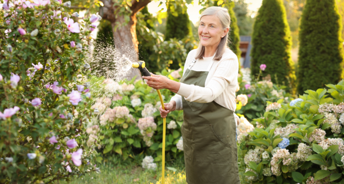
Formerly a financial analyst, Avery translates complex research into clear, informative narratives. Her evidence-based approach provides readers with reliable insights, presented with clarity and warmth. Outside of work, Avery enjoys trail running, gardening, and volunteering at local farmers’ markets.
More Articles by Avery