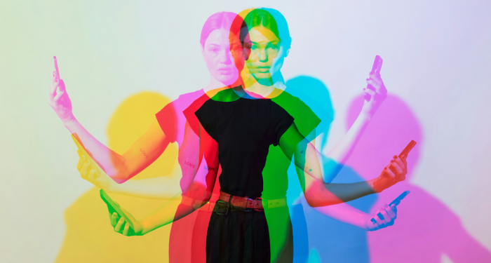
Some colors drain you quietly. Swap them, and the whole mirror changes.
The minute I stopped dressing “for the office” and started dressing for me, I noticed something surprising: some of my old go-to colors made me look… tired.
Not just end-of-day tired—more like “did you sleep at all?” tired.
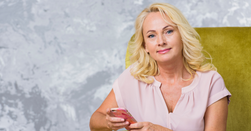
If you’ve hit retirement or you’re just easing into a new season of life, your coloring can shift. Hair goes lighter or silver, skin loses a touch of contrast, and the hues that once felt sharp can suddenly drain you.
The good news? A few smart swaps make a world of difference.
Below are eight colors that commonly add years—and what to wear instead. As always, try things near your face in natural light. Take a quick selfie. Your camera will tell you the truth faster than the mirror.
1. Head-to-toe black
I know, I know. Black is “chic,” “slimming,” and basically a lifestyle. But once hair softens or grays, pure black near the face can emphasize under-eye shadows and fine lines. It’s the contrast.
On mature skin, hard contrast can look harsh instead of elegant.
What to try instead: navy, deep charcoal, espresso, or “soft black” fabrics (washed black denim, matte knits, textured weaves).
If you love your black blazer, keep it—but add a scarf or shirt in a face-friendly color (teal, raspberry, ivory). A brighter lipstick and small metallic earrings also bounce light back to your features.
As artist Wassily Kandinsky said, ‘Color is a power which directly influences the soul.’
He wasn’t talking about wardrobes, but the point stands: color changes how we look and feel—instantly.
2. Muddy beige and khaki
I spent years as a financial analyst living in “neutral” blazers. I thought they were safe; they were actually sabotaging me.
Muddy beige, greige, and certain khakis are often the exact value of our skin tone—so they blur with our face and make us look washed out.
What to try instead: choose contrast and clarity. Camel, warm sand, oatmeal heather, ivory, and rich caramel usually add dimension.
If you love tan, pair it with crisp white, navy, or a saturated scarf to create separation from your skin.
Quick test: hold the garment under your chin. Do your eyes look brighter or duller? If it’s the latter, that beige is too close to your skin value.
3. Dull mustard
Mustard has been trendy in recent years, but the muted, brown-leaning versions can make warm complexions look sallow and cool complexions appear sickly.
It’s not yellow in general—it’s the “dirty” mustard that steals freshness.
What to try instead: clearer golds and marigold for warm undertones; sunny lemon, daffodil, or butter yellow for cool undertones. If you’re unsure, step up one notch in brightness.
The livelier the yellow, the more it lifts your face. And if yellow still scares you, keep it below the waist.
4. Ashy gray
Gray is versatile, but the wrong gray (especially ashy or green-gray) can flatten your complexion and highlight grays in your hair in a way that looks more “tired” than “tonal.” It’s the funeral-filter effect.
What to try instead: mid-tone heather grays with texture, silver-leaning gray, or stone with a bit of warmth. Bonus points for sheen—silk, sateen, or fine merino—because a whisper of light reflection counteracts dullness.
Pair with a colored shoe or lip to keep the look intentional.
Pro tip: if you wear glasses, try frames in tortoise, cranberry, or soft teal with gray outfits. The pop near your eyes does the heavy lifting.
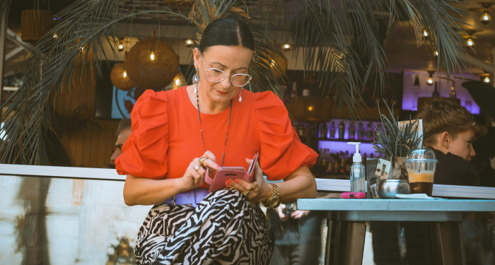
5. Dusty rose and mauve
Dusty pinks have a vintage charm, but they can read “bruised” on mature skin, emphasizing redness or uneven tones.
I love a retro palette as much as anyone, yet the moment a rose gets too gray, I look like I’ve caught a head cold.
What to try instead: lively pinks—peony, watermelon, fuchsia (in softer fabrics), or warm salmon. If you prefer subtle, choose a pink with a hint of peach; it acts like blush for your whole face.
Keep makeup minimal and let the color do the brightening.
6. Olive drab and army green
Utility greens are great for structure, not always for skin. Olive drab (the dull, brown-olive used in uniforms) can pull up under-eye green and cast shadows around the mouth.
What to try instead: brighter sages, fresh eucalyptus, emerald, or teal. These greens have more clarity and blue, which tends to make teeth and eyes look whiter.
If you adore your field jacket, layer a white or cream tee and add a light-catching pendant to lift the center of your face.
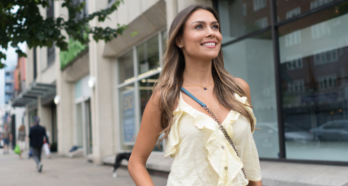
7. Baby pastels
Baby blue and baby pink can veer saccharine and dated—like you borrowed a cardigan from your childhood self. On mature faces they sometimes read “costume” instead of “classic,” especially in stiff fabrics.
What to try instead: grown-up pastels with backbone. Think robin’s-egg, periwinkle, hydrangea blue, coral, or soft coral-peach.
';.,These shades are slightly more saturated, which adds presence without shouting. In summer, swap baby pastels for white linen plus a bolder accent (turquoise earrings, coral lip).
8. Neon brights
Neons are fun for a fun run; in everyday life they act like a highlighter pen on every line and freckle. Because neon sits next to your skin in intensity, it can emphasize texture rather than glow.
What to try instead: jewel tones—amethyst, teal, sapphire, garnet—deliver impact without the harsh glare.
They’re also beautiful with silver hair.
Keep silhouettes simple and let the color speak.
Designer Edith Head famously said, ‘You can have anything you want in life if you dress for it.’
I’ve found that true in retirement too—not because clothes change who we are, but because they change how we show up.
How to figure out your face-friendly colors (fast)
Not sure where to start? Try these quick checks the next time you’re by a window.
-
The white paper test: Hold a white sheet under your chin in daylight. If your face looks lively, you probably do well with cooler, clearer colors (navy, cranberry, cobalt). If white makes you look stark, try off-white, cream, or warm neutrals and corresponding warmer colors (teal-green, tomato red, marigold).
-
The hair harmony rule: As hair lightens or silvers, choose colors that either echo that softness (soft blues/grays) or deliberately contrast with it (teal, berry, emerald). Middle-of-the-road, muddy tones tend to wash out.
-
Texture and sheen matter: Even “tricky” colors become wearable with the right fabric. Matte black can be harsh; a nubby black bouclé reads softer. Ashy gray is dull in jersey; in silk with a little drape, it reflects light.
-
Place the power near your face: Keep the enlivening colors in scarves, earrings, lipstick, sweaters, and blouses. You can still wear your beloved tricky shades in pants, shoes, or bags without consequence.
Simple swaps you can make this week
-
Replace a black tee with deep navy or smoky charcoal.
-
Trade dusty rose for peony or salmon.
-
Swap olive drab for sage or teal.
-
Upgrade baby blue to periwinkle; baby pink to coral.
-
If you live in beige, choose camel or warm sand and add a crisp white shirt.
-
Retire the neon gym jacket for an amethyst windbreaker or teal gilet.
A note on prints, metals, and makeup
-
Prints: Look for prints that include one of your “alive” colors near the face. High-contrast black-and-white can be harsh; try navy-and-ivory or cobalt-and-cream for a kinder effect.
-
Jewelry metals: Silver, pewter, and white gold often flatter cool undertones and silver hair; gold, bronze, and rose gold warm up golden undertones. Mixed metals are a safe middle path.
-
Makeup: A touch more color helps as hair lightens. A soft brow, a defined lash line, and a lip a shade brighter than you think can balance your outfit choices. Even if you’re minimalist (me, most days), this tiny tweak helps your clothes work harder for you.
Mindset matters more than rules
If you adore one of the eight “aging” colors, keep it. Style is personal. My goal isn’t to hand you a rule book; it’s to offer a toolkit. When a hue makes you look tired, it’s not a character flaw—it’s just a color mismatch.
Here’s what I ask myself before I buy or wear anything now: Do I look fresher with this on? Do my eyes lift? Does my skin look smoother? If yes, it’s a yes—even if it breaks someone’s “season” chart.
As noted by countless color experts, there’s no single formula that fits every face. But there is a consistent effect: clearer, contrast-aware colors make us look energized. And that energy is the whole point of this chapter of life—more time, more freedom, more you.
Final thoughts
Retirement isn’t the end of style; it’s the beginning of dressing for your real life. If a few shades in your closet are sneaking years onto your face, swap them out and see how you feel. You might be surprised by how a small shift—navy over black, peony over mauve—reframes your day.
Try one change this week. Wear it on a walk, to the farmer’s market, or out to lunch. Notice how people respond. More importantly, notice how you respond to yourself in the mirror. If your reflection looks a little more awake, a little more “you,” you’re on the right track.
Because in the end, the best color on you is the one that makes you light up.