The moment I started introducing even subtle contrasts, people started commenting that I looked well-rested and healthy, and nothing else had changed.
Ever catch your reflection and think, "When did I start looking so tired?"
I had this exact moment last year. I was getting ready for a friend's birthday dinner, wearing what I thought was a chic beige blazer with a cream blouse underneath. My partner walked by and gently suggested I might want to try something with "more life to it." At first, I was defensive. But when I looked in the mirror again, really looked, I saw what he meant. The outfit wasn't just boring. It was aging me.
That's when I started paying attention to color combinations in a whole new way. As someone who spent years analyzing data and patterns in my corporate days, I became fascinated by how certain color pairings can add years to our appearance without us even realizing it.
The truth is, it's not about individual colors being "bad." It's about how they interact with each other and with our skin tone. Some combinations drain the vitality right out of our faces, while others make us look refreshed and energized.
Let's talk about the worst offenders.
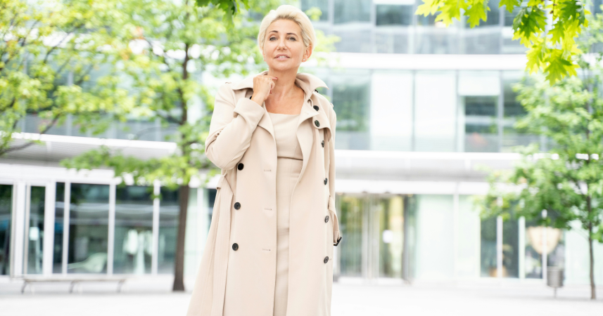
1. All beige everything
Look, I get the appeal of monochromatic beige. It feels safe, sophisticated, put-together. But here's what happens when you wear beige on beige on beige: you blend into yourself.
The lack of contrast makes your features disappear. Your face loses definition. And if you're over forty like me, this can be especially problematic because our skin naturally loses some of its vibrancy over time.
I learned this the hard way during my corporate days. I thought I was dressing professionally, but I was actually washing myself out every single day. The moment I started introducing even subtle contrasts, people started commenting that I looked "well-rested" and "healthy." Nothing else had changed.
2. Black paired with harsh white
This combination seems like a classic, right? Black and white. Timeless. Elegant.
Except when it's not.
The stark contrast between pure black and bright white can create harsh shadows on your face, emphasizing every line and making circles under your eyes look darker. It's particularly aging when worn near the face, like a white collar on a black shirt or a black scarf with a white top.
This high-contrast pairing can be "unforgiving," especially in natural light where it tends to cast unflattering shadows.
A softer approach works better. Try charcoal with cream, or black with soft ivory instead.
3. Dusty mauve with gray
This was my go-to combination for years, and I genuinely thought I looked great. Mauve felt feminine, gray felt modern. Together? They felt sophisticated.
What I didn't realize was that this pairing was draining every bit of warmth from my complexion. Both colors have a muted, cool quality that can make skin look sallow and tired. When you combine them, you get double the aging effect.
The problem is that these colors lack the brightness and warmth that bring life to your face. They sit in that middle zone of being neither light enough to brighten nor dark enough to create flattering contrast.
4. Navy with brown
I see this combination everywhere, particularly in "professional" wardrobes. Navy pants with brown shoes. Brown belt with a navy dress. It's considered a safe, conservative choice.
But safe doesn't always mean flattering.
Navy and brown together create a muddy, heavy look that can weigh down your entire appearance. Both colors are quite serious and deep, and when paired together near the face, they can cast shadows that make you look exhausted.
This doesn't mean you can never wear these colors. Just avoid having them meet directly at your neckline or in concentrated areas near your face.
5. Olive green with khaki
Have you ever noticed how military uniforms, while functional, aren't exactly designed to make people look youthful and vibrant?
That's essentially what you're doing when you pair olive green with khaki. Both colors have an earthy, muted quality that can make your skin look dull and aged. They lack the brightness and clarity that gives your complexion a healthy glow.
I made this mistake during a camping trip last summer. I thought I was being practical and outdoorsy. My friend took a photo of our group, and when I saw it later, I looked at least ten years older than everyone else. Same lighting, same setting, different color choices.
6. Burgundy with rust orange
On paper, this sounds warm and autumnal. In practice, it often looks muddy and aging.
The issue is that both colors are quite saturated and exist in the same warm, earthy family. When you put them together, they compete with each other rather than creating a harmonious balance.
The result can make your skin look ruddy or uneven, particularly if you have any redness in your complexion to begin with.
7. Pale pink with baby blue
This combination screams Easter Sunday circa 1985. And that's exactly the problem.
These soft pastels together create an overly sweet, dated look that adds years simply because they feel stuck in another era. They also tend to wash out most skin tones, making you look pale and tired rather than fresh and youthful.
What makes it worse is that these colors lack depth. They float on the surface without creating any interesting visual dimension. Your eye doesn't know where to land, so you end up looking forgettable and faded.
8. Charcoal gray with slate blue
I spent an entire winter wearing variations of this combination, thinking I looked polished and professional. My colleague finally asked if I was feeling okay because I "looked a bit under the weather."
That was my wake-up call.
Both charcoal and slate blue are cool, muted tones that can make your complexion look ashen. Together, they create a somber, drained appearance that's particularly aging in winter months when we're already dealing with less natural light and paler skin.
The lack of warmth in this pairing is the real culprit. Our faces need some warmth in our clothing choices to look vibrant and healthy.
9. Taupe with mushroom brown
If beige on beige is bad, taupe on mushroom brown is worse. At least beige has some lightness to it. This combination exists entirely in the murky middle ground where colors go to die.
Both taupe and mushroom brown are incredibly muted, cool-toned neutrals. When paired together, they create a flat, lifeless look that does absolutely nothing for your complexion. There's no contrast, no brightness, no visual interest. Just blah.
I see women wearing this combination all the time, especially in supposedly "timeless" professional wardrobes. But timeless shouldn't mean soul-sucking.
10. Faded denim with washed-out gray
This is the "I gave up" combination, even when you haven't actually given up.
Both pieces are so washed out and lacking in color saturation that they make everything about you look tired and dated.
The faded quality of both colors suggests wear and age, which then translates to your appearance.
The solution? Choose one or the other, but not both. If you're wearing faded jeans, pair them with something that has more color saturation and brightness.
Final thoughts
Here's what I want you to take away from this: you don't need to throw out your entire wardrobe.
The point isn't that these individual colors are terrible. It's that certain combinations work against you instead of for you. Small adjustments can make a huge difference.
Since I started paying attention to color combinations, I've noticed a real change in how I feel when I get dressed and how others respond to me. People comment more often that I look "great" or "refreshed" without being able to pinpoint exactly why.
That's the magic of getting color combinations right. It's subtle but powerful.
If you're struggling to figure out what works for your specific skin tone and coloring, consider scheduling a session with a color consultant or even just taking photos of yourself in different combinations and seeing which ones make you look most vibrant and alive. Sometimes we need that objective perspective to see what we've been missing.
Your clothes should make you look like the best version of yourself, not add years you haven't earned yet.
If You Were a Healing Herb, Which Would You Be?
Each herb holds a unique kind of magic — soothing, awakening, grounding, or clarifying.
This 9-question quiz reveals the healing plant that mirrors your energy right now and what it says about your natural rhythm.
✨ Instant results. Deeply insightful.