
Homes feel truly elevated when they tell the truth about the people inside.
I love good design, but I also know how easy it is to chase a vibe instead of building a home.
Working in luxury hospitality taught me this: real quality doesn’t shout. It feels good, works hard, and gets better with time.
If you’ve ever looked around your place and thought, “Why does this look… loud?” this one’s for you.
Below are eight common decor moves that read as trying too hard.
I’ll show you what’s off, why it happens, and what to do instead so your space feels confident, not performative.
1) Logo mania everywhere
A few years ago I visited a friend who’d just “upgraded” his living room.
On the sofa was an Hermès-style throw, complete with that unmistakable H; on the shelves sat empty designer boxes, arranged like trophies.
Even his tissue box cover wore a luxury monogram.
Here’s the thing: Real luxury rarely needs to scream its own name.
When every surface is branded, it can feel like a billboard for insecurity.
It’s the decor version of ordering the most expensive wine on the list in a restaurant you barely know.
You’re signaling status instead of showing taste.
Ask yourself a simple question: If the logos disappeared, would the room still be interesting?
If the answer is no, swap branded props for pieces with texture, color, and story.
Think heirloom textiles, original art from a local market, or a handmade bowl you found while traveling.
Those choices whisper substance instead of shouting pedigree.
2) Mirrored furniture and crystal overload
A little shine goes a long way, but a lot of shine turns a room into a nightclub at 11 a.m.
Mirrored dressers, reflective side tables, crystal lamps, chrome legs, and a chandelier big enough to land a helicopter under it.
Put all that together and you’re auditioning for a music video.
I learned in luxury F&B that lighting and reflection matter.
We used mirrors strategically to bounce a soft glow, not to flash in every direction.
Good hospitality design aims for flattering light you barely notice.
It never blinds you from six angles while you sip your espresso.
Let texture do the heavy lifting: Linen, wood grain, stone, and matte ceramics bring depth that bright shine can’t.
3) Faux finishes doing all the talking
Peel-and-stick marble on every flat surface, contact-paper “brass” on appliances, and stick-on molding to fake architectural detail.
I get the temptation that it’s fast and looks good in a thirty-second reel.
But, in person, the seams, corners, and wear show up quickly.
When a countertop tries to be Carrara and a bookshelf pretends to be walnut, the room starts to feel like a costume party.
There’s a reason restaurants obsess over materials: Real stone ages with grace.
Solid wood picks up character, while faux finishes often age like a cheap suit after a long shift.
If you’re renting or on a tight budget, go honest.
Paint a clean, rich color and use solid butcher block and care for it or choose ceramic that looks like ceramic.
Authenticity reads better than imitation, and it’s easier to maintain.
4) The staged bar cart that never gets used
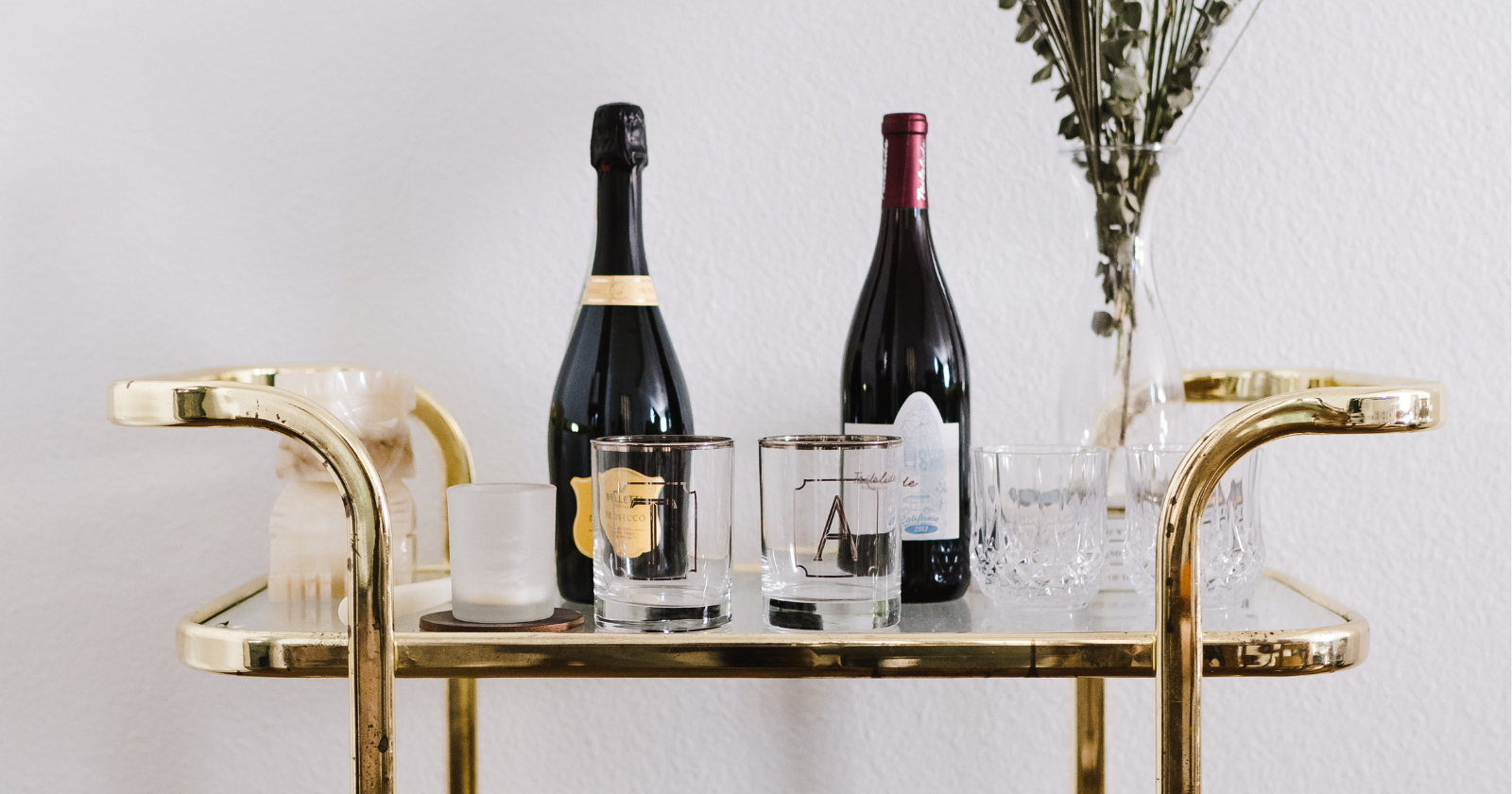
I love a good drink station.
Years in hospitality taught me the pleasure of a well-made Old Fashioned and the beauty of proper tools.
But the “look at me” bar cart piled with decanters of colored water, trophy bottles that are always full, and a dozen crystal coupes that never move?
That’s cosplay, because a real bar, even a tiny one, shows life.
If you want the vibe, keep it functional: Stock two spirits you enjoy and a couple of mixers, and add one great tool set, not five.
Display a small stack of bar napkins and a book you’re genuinely reading about cocktails, then invite a friend over and make something.
Use is the best style.
5) Coffee table books that exist only for clout
I’m a book person.
Nonfiction stacks up around me like little cities, but I actually open them.
The coffee table that hosts immaculate, shrink-wrapped towers of “Chanel,” “Tom Ford,” and “Architectural Digest” that have never been read feels like a movie set.
There’s no soul in a prop library.
A good book selection tells a story about the person who lives there.
Maybe there’s a dog-eared cookbook with olive oil stains, a travel photo book from a city you fell in love with, or a design title you keep revisiting for one specific chapter on lighting.
When guests pick it up, there’s a conversation waiting.
If your books are just there to look expensive, you’ll get the look and none of the warmth.
Curate for curiosity, not clout.
6) Copycat furniture that almost gets it right
You know the chair: It’s the iconic silhouette from your favorite design account, except the angles are off and the wood finish looks like it came out of a printer.
Replicas can be fine in theory, but the bad ones miss the proportions and materials that make the original special.
It’s like eating a frozen version of a dish that’s supposed to be cooked à la minute.
The form is there, the flavor isn’t.
In restaurants, we talk about fidelity to the idea; you need proper seasoning, heat, and rest.
In furniture, that translates to solid joinery, comfortable ergonomics, and finishes that improve with touch.
If the real thing is out of reach, look for pieces inspired by the spirit, not the exact shape.
Buy vintage from lesser-known makers, pick sturdy construction over “iconic” curves, or save up for one hero piece and let inexpensive, honest items support it.
One authentic anchor beats a room full of almosts.
7) Gold everywhere, quality nowhere
Brass, bronze, and gold are gorgeous when they appear in measured doses and age gracefully.
However, the trend of spraying everything in metallic paint, swapping every handle for bright gold, and scattering shiny objects on every surface reads more costume than couture.
In kitchens I’ve worked with, real brass develops a soft patina from fingers and time.
It tells a quiet story of use and the illusion unravels fast.
If you crave warmth, start with one or two metal accents and let them earn their place.
Mix in matte black or natural wood to calm the glare.
Choose quality over quantity.
A single well-made sconce can do more for a room than ten sparkly knickknacks vying for attention.
8) Curtains and rugs that fake grandeur
Finally, let’s talk scale, because nothing tries harder than a tiny rug doing the job of a big one or curtains puddling dramatically like a red carpet gown.
People think extra fabric equals extra fancy but, when the rug floats under a coffee table while the front legs of the sofa and chairs are miles away, the room looks smaller and cheaper.
In hospitality, scale is everything.
Banquette height, table clearance, aisle width, and sightlines are measured so guests feel comfortable without noticing why.
At home, putting scale first solves most of the “trying too hard” vibe.
Get a rug large enough that at least the front legs of major seating sit on it, hang curtains high and just kiss the floor, and choose a heavier fabric if you want drape, then hem them properly.
If budget is tight, layer a big natural-fiber rug with a smaller patterned rug on top.
It looks intentional and solves the postage-stamp issue.
For windows, line the panels.
Lined fabric falls better, blocks weird light, and instantly looks more considered.
The bottom line
Homes feel truly elevated when they tell the truth about the people inside, not when they dress up as someone else’s highlight reel.
When you trade logos for stories, sheen for texture, and performance for function, the room relaxes and you do too.
If any of this hit a nerve, don’t throw everything out.
Little choices compound; that’s true in the gym, the kitchen, and at home.
Focus on what you use and love, then let the rest go.
That’s where real confidence lives, and it looks good in any light.