Looking expensive isn't about spending more money. It's about making smarter choices with what you already have, starting with the colors closest to your face.
![]()
Add VegOut to your Google News feed. ![]()
There's this woman I see sometimes at my usual coffee shop in Venice Beach. She's probably in her fifties, and I have no idea what she does for a living, but every single time I see her, she looks expensive.
Not flashy. Not covered in logos. Just... expensive.
It took me a while to figure out what created that impression. It wasn't the cut of her clothes, though they fit well. It wasn't jewelry because she barely wore any. It was the colors she chose.
Rich, deliberate colors that seemed to elevate everything else about her appearance.
As someone who spends way too much time analyzing why we make the choices we make, I started paying attention to this pattern. What colors consistently make people look more polished, more put-together, more expensive?
Let's break down what those colors are and why they work.
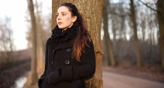
1) Deep navy instead of basic black
Everyone defaults to black because we've been told it's sophisticated and slimming and goes with everything.
But here's what I've noticed: truly elegant women often reach for deep navy instead.
Navy has all the versatility of black without the harshness. It's rich, it's deep, and it works with almost every skin tone without draining color from your face the way stark black can.
There's also something about navy that reads as intentional rather than default. Black is easy. Navy is a choice, and that choice signals someone who thinks about these things.
Navy also photographs beautifully, which matters more than it used to now that so much of our lives ends up documented somewhere.
2) Camel and cognac tones that add warmth
There's a reason luxury brands return to camel every single season. It's the color of expensive.
Rich camel, cognac, and warm tan shades have an inherent luxe quality that's hard to replicate with other colors. They look expensive even in inexpensive fabrics, though they truly shine in quality materials like wool, leather, and cashmere.
These warm neutrals work because they're sophisticated without being stark. They add warmth to your complexion instead of competing with it, and they create a cohesive, pulled-together look that seems effortless.
Women who consistently look expensive often build entire capsule wardrobes around these shades because they're so versatile and inherently elevating.
A camel coat over jeans instantly makes the whole outfit look more expensive. Cognac boots upgrade any casual look. It's almost magic how much these colors do the heavy lifting.
3) Cream and ivory over bright white
Bright white can be beautiful, but it's also incredibly unforgiving and can look harsh or cheap depending on the fabric.
Elegant women tend to gravitate toward cream, ivory, and off-white shades instead. These softer whites have a richness that pure white lacks, and they're infinitely more flattering against most skin tones.
There's also a practical element here. Cream hides imperfections better than stark white, which means your clothes look newer and better maintained for longer. That contributes to an overall impression of quality and care.
Cream and ivory also pair beautifully with other expensive-looking colors, creating tonal outfits that look sophisticated and intentional rather than matchy-matchy.
The whole "winter white" concept exists because these softer whites feel luxurious in a way that bright white often doesn't.
4) Burgundy and wine shades that exude richness
Deep burgundy, wine, and oxblood shades are instant elegance.
These colors have a richness and depth that immediately elevates an outfit. They're bold without being loud, distinctive without being attention-seeking.
There's something about these deep red tones that's universally flattering. They work across seasons, they complement most skin tones, and they pair well with both warm and cool colors in your wardrobe.
I invested in a burgundy leather jacket a few years back, and it's become one of those pieces that instantly makes me look more put-together than I actually am. It does the work for me.
These shades also have a timeless quality. They don't read as trendy or of-the-moment, which means pieces in these colors stay relevant in your wardrobe for years.
When you see someone in a beautiful wine-colored sweater or burgundy trousers, your brain automatically registers "expensive" even if you couldn't explain why.
5) Emerald and forest green for unexpected sophistication
Green is underrated in fashion, but elegant women have figured out that the right greens are incredibly sophisticated.
Emerald and deep forest green have a jewel-tone richness that looks expensive and intentional. These aren't the safe neutrals, but they work like neutrals in how versatile they are.
There's something unexpected about green that makes people look twice, but these deeper shades do it in a refined way rather than a loud way.
Color research shows that deep greens are associated with wealth, nature, and stability. They have an organic luxury to them that feels grounded and real rather than flashy or artificial.
I've noticed that when I wear my forest green sweater, people consistently compliment it in a way they don't with other colors. There's something about that shade that registers as special.
These greens also photograph beautifully and work across seasons. An emerald dress in summer, a forest green coat in winter—both look expensive and intentional.
The key is going deep and rich with the shade rather than bright or pastel. Jewel-tone greens signal quality in a way that lighter greens often don't.
6) Charcoal gray as a refined neutral
If navy is black's sophisticated cousin, charcoal gray is its elegant sibling.
Medium and charcoal grays have a refinement that's hard to match. They're neutral enough to work with everything but interesting enough to look intentional rather than default.
What makes gray look expensive is choosing the right shade. Too light and it can look washed out. Too dark and it basically becomes black. But that perfect charcoal gray in quality fabric looks like a million dollars.
Gray also has this wonderful ability to make other colors pop. Pair it with burgundy, emerald, or cream and suddenly your whole outfit looks more expensive because the gray provides such a sophisticated backdrop.
I live in California where everyone's wearing black or bright colors, so gray stands out as deliberately understated in a way that reads as confident and expensive.
It's also incredibly practical. Gray hides wear better than black, works year-round, and transitions seamlessly from casual to formal depending on how you style it.
7) Chocolate brown for unexpected versatility
Brown got a bad rap for years as boring or dowdy, but rich chocolate brown is having a moment for good reason.
Deep chocolate brown has a warmth and richness that's incredibly sophisticated. It's unexpected enough to be interesting but classic enough to feel timeless.
What makes brown look expensive versus cheap is all about the depth and richness of the shade. Muddy browns can look drab, but deep chocolate or espresso brown looks luxurious and deliberate.
There's also something about brown that feels more approachable than black while maintaining the same level of sophistication. It's softer, warmer, more human somehow.
I've mentioned this before, but choosing colors with richness and depth makes all the difference. Chocolate brown embodies that principle perfectly.
These deep browns pair beautifully with other expensive-looking colors: cream, camel, burgundy, navy. They create tonal outfits that look incredibly sophisticated without being boring.
The bottom line
Here's what's important to understand about color and looking expensive: it's not about the price tag on your clothes.
It's about choosing rich, deep, intentional colors that complement your skin tone and signal that you've thought about your choices.
These eight colors work because they have depth, richness, and sophistication built into the shades themselves. They're not trying too hard, but they're not boring either.
The women I see who consistently look elegant and expensive have figured out that color is doing half the work for them. Choose the right palette and even simple, affordable pieces look elevated.
Pay attention to what colors make you feel confident and polished. Build your wardrobe around shades that work for you rather than defaulting to basic black or following trends that don't serve you.
What’s Your Plant-Powered Archetype?
Ever wonder what your everyday habits say about your deeper purpose—and how they ripple out to impact the planet?
This 90-second quiz reveals the plant-powered role you’re here to play, and the tiny shift that makes it even more powerful.
12 fun questions. Instant results. Surprisingly accurate.