Your style should evolve with you, not trap you in someone else's idea of what's "appropriate" for your age.
![]()
Add VegOut to your Google News feed. ![]()
I used to think fashion was just about wearing what you like. Then I hit my forties and started noticing something odd: certain colors I'd always loved suddenly made me look washed out in photos. Not tired, exactly. Just... older.
It got me curious. As someone who spends way too much time analyzing why we make the choices we make, I started paying attention to what women in their sixties were wearing and how different colors affected their whole vibe.
Turns out, there's actual psychology and science behind why some shades age us while others do the opposite. And no, this isn't about following arbitrary rules or ditching your favorite sweater because some style guide says so.
It's about understanding what works with your skin, your energy, and the image you want to project. Because looking good isn't about chasing youth. It's about looking like the best version of yourself right now.
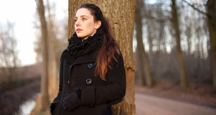
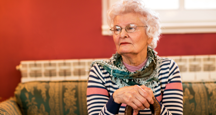
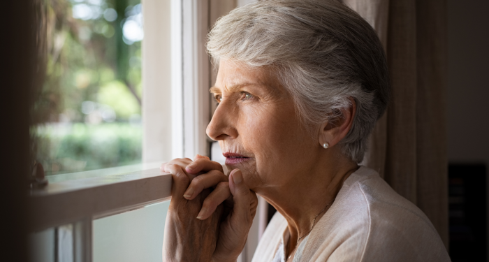
1) Stark black everywhere
Black is supposed to be timeless, right? The wardrobe staple that works for everything?
Except when it doesn't.
I noticed this at a friend's art opening last year. Two women, both probably mid-sixties, both wearing head-to-toe black. One looked sophisticated and pulled together. The other looked drained, like the color was literally sucking the life from her face.
The difference? Skin tone and contrast.
As we age, our skin loses some of its natural pigmentation and the stark contrast of pure black can be unforgiving. It highlights every shadow, every line, every bit of unevenness in your complexion.
Black works beautifully when you have high natural contrast, strong coloring, and vibrant undertones. But if your skin has become lighter or more muted over the years, solid black worn close to your face can create a harsh effect that instantly ages you.
The solution isn't ditching black entirely. It's about moving it away from your face or softening it with layers. A black jacket over a cream top? Perfect. Black pants with a jewel-toned sweater? Absolutely.
2) Beige and tan in similar tones to your skin
There's this idea that neutral colors are "safe" choices. Beige, tan, taupe... they're supposed to be elegant and understated.
But here's what actually happens: if you're wearing a shade of beige that's too close to your skin tone, you disappear into your clothes. There's no definition, no contrast, nothing for the eye to focus on except the parts of you that are changing with age.
I've seen this dozens of times at coffee shops in Venice Beach. Women wearing beautiful, expensive-looking beige and camel pieces that somehow make them look older and more washed out than they probably are.
The psychology here is fascinating. Our brains are wired to notice contrast and definition. When everything blends together in similar tones, we read it as flat and lifeless.
This doesn't mean avoiding neutrals. It means choosing ones that create some separation between you and your clothing. If your skin is warm-toned, try cooler beiges. If you're cool-toned, warmer camels might work better. Or layer different neutral shades to create depth.
3) Dusty pastels that drain your complexion
Pastels can be tricky at any age, but they become especially complicated as our skin tone shifts.
Those soft, dusty versions of pink, blue, and lavender that look so pretty on the hanger? They can make you look exhausted if they're not the right undertone for your complexion.
I learned this the hard way with a dusty rose shirt I bought a few years back. Loved it in the store, hated every photo I took wearing it. I looked like I needed a nap and about three cups of coffee.
The issue is that these muted pastels lack the vibrancy to reflect light back onto your face. Instead of brightening your complexion, they can emphasize sallowness or grey undertones that naturally develop as we age.
Research in color psychology shows that certain shades can actually affect how others perceive our health and vitality. When a color drains you, people unconsciously read you as less energetic and yes, older.
If you love pastels, go for clearer, brighter versions. Think coral instead of dusty pink, periwinkle instead of powder blue. These have enough saturation to give your face a boost rather than taking away from it.
4) Yellow that clashes with your undertones
Yellow is complicated because it comes in so many variations, and wearing the wrong one can be aging in ways that aren't immediately obvious.
The wrong yellow near your face can emphasize any sallowness in your skin, make your teeth look more yellow, and generally create an unflattering effect that adds years.
I'm not talking about all yellows here. Some people look absolutely radiant in certain shades. But if you have cool undertones and you're wearing a warm, golden yellow, or vice versa, you're fighting against your natural coloring.
There's also a cultural association between certain shades of yellow and illness or jaundice. Our brains make these connections unconsciously, which means the wrong yellow can trigger subtle negative perceptions.
Pay attention to how you feel in yellow. Do you look bright and alive, or do you look like you're coming down with something? That gut reaction is usually right.
If yellow isn't your color, that's completely fine. There are hundreds of other options that will make you look vibrant and current.
5) Muddy browns that lack richness
Brown should be elegant. It's an earth tone, it's natural, it should work.
But there's a huge difference between a rich chocolate or warm cognac and those flat, muddy browns that have no depth or dimension.
The muddy versions, especially in that middle-ground khaki-brown territory, can make your whole appearance look dated and tired. They lack the vibrancy to bring life to your face, and they often read as dull rather than sophisticated.
This is partly about color saturation. As noted in research on color perception, our ability to see subtle color differences changes slightly as we age, which means we need more saturation and clarity in our colors to achieve the same visual impact.
If you love brown, embrace it. But choose versions with richness and depth. Think espresso, caramel, or warm auburn tones that have enough intensity to work with your complexion rather than against it.
6) Gray that's too close to your hair color
Gray hair is having a moment, and rightfully so. It can be absolutely stunning.
But here's the tricky part: if you're wearing gray clothing that's too similar to your gray hair, everything blends together in a way that ages you instantly.
I've mentioned this before, but color contrast is crucial for creating definition and visual interest. When your hair and your clothes are basically the same shade of gray, your face gets lost in the middle. There's no frame, no pop, nothing to draw the eye.
This is especially noticeable in photos, where the lack of contrast can make you look washed out and older than you are in person.
The solution isn't avoiding gray clothing. It's about choosing shades that contrast with your hair. If your hair is silver-white, try charcoal or pewter. If it's steel gray, lighter shades or even warm grays might work better.
Or simply move the gray away from your face entirely. Gray pants or skirts with a completely different color on top can look incredibly sophisticated.
7) Overly muted or grayed-out colors
There's a difference between sophisticated muted tones and colors that have been so desaturated they look tired.
These overly muted, grayed-out versions of colors, often marketed as "sophisticated" or "mature," can actually make you look older by association. They lack the energy and vibrancy that makes someone look vital and engaged with life.
I see this a lot in "age-appropriate" fashion advice that basically tells women over sixty to tone everything down. Wear quieter colors. Don't be too bold. Don't stand out.
But looking at behavioral research, there's no evidence that wearing vibrant colors is somehow inappropriate at any age. In fact, wearing colors with some saturation and life to them can make you appear more energetic and youthful.
This doesn't mean everything needs to be neon bright. It means choosing colors that have enough intensity to reflect light onto your face and create a lively, engaged impression.
If you're drawn to muted tones, make sure they have some warmth or depth to them. A muted teal with richness is very different from a flat, grayed-out version of the same color.
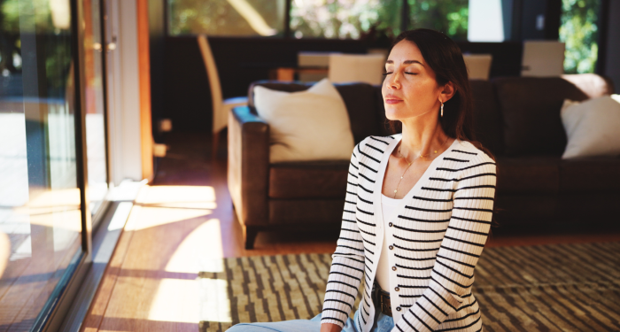
The bottom line
Color is powerful, but it's not about following rigid rules or avoiding entire sections of the spectrum.
It's about understanding what works with your current coloring, choosing shades that reflect light onto your face rather than draining it, and wearing things that make you feel confident and alive.
The women I see who look most vibrant and youthful aren't necessarily wearing any particular colors. They're wearing the right colors for them, with confidence and intention.
Pay attention to how you feel in different shades. Trust your instincts. And remember that looking good at any age is about enhancement, not disguise.