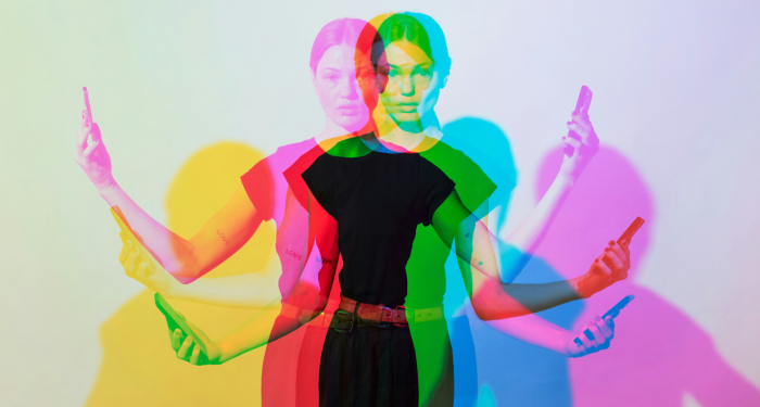
What once felt impressive now feels excessive. And what feels effortless today will eventually change too.
Back when I worked in luxury F&B, I saw firsthand how fast trends come and go.
One season, a certain champagne label was the only thing anyone wanted on their table. Six months later, it was considered outdated. The same thing happens with brand logos. What once signaled exclusivity now feels more like a loud shout for attention.
It’s interesting to watch how a logo can shift from aspirational to overexposed. Part of it comes from cultural changes. Part of it comes from how we grow up and refine our own tastes.
And part of it comes from realizing that subtle confidence lasts longer than flashy branding ever will.
So today, let’s talk about eight logos that once felt like the pinnacle of taste but now feel more like relics from a different era.
1) The giant Coach “C” pattern
There was a time when having a Coach bag covered in oversized Cs meant you’d made it. Everyone wanted one. They were the go to gift, the go to flex, the go to sign that you were leveling up.
But as styles shifted, the logo became a victim of its own popularity. When a brand becomes so widespread that counterfeit versions pop up at every street corner, the visual impact loses its charm. People started craving quieter luxury and simpler designs.
This pattern still holds some nostalgic value, but in terms of aesthetics, the loud repetition feels dated and a little try hard. And honestly, subtlety always has a longer shelf life.
2) Abercrombie & Fitch’s massive front logo
If you were a teen or young adult in the 2000s, you probably remember the giant A&F lettering across hoodies and tees. It was practically a uniform. The brand built its entire identity on being exclusive, and the logo became shorthand for belonging.
But exclusivity doesn’t age well when it is built on bold branding instead of actual craftsmanship. By the time I was transitioning out of hospitality and into writing, the market had shifted.
Minimalism replaced maximalism, and suddenly wearing a shirt that shouted its brand felt out of place.
Abercrombie has rebranded beautifully in recent years, leaning into subtle elegance instead of in your face logos. Ironically, removing the giant lettering is what made the brand relevant again.
3) Ed Hardy’s tattoo-style graphics
I still remember serving drinks to groups of people decked out in Ed Hardy from head to toe. Rhinestones, bright colors, and massive illustrations were everywhere. The logo itself wasn’t always the star, but the branding was unmistakable.
Back then, it had attitude. It felt rebellious. But over time, the look became associated with over the top, flash for the sake of flash styling. Once the fad died, the logo lost its appeal almost overnight.
Now, when you see someone wearing it, the immediate thought is usually nostalgia rather than admiration. It’s a reminder of a trend cycle that burned fast and bright but didn’t hold up.
4) The huge Hollister bird
Hollister was another brand that thrived on visibility. If the giant bird wasn’t flying across your chest, did you even shop there? It signaled youth, surf culture, and a specific social crowd.
But as fashion matured, so did our preferences. The logo, once a cool badge of belonging, now feels more like something you’d only wear to paint your house. And honestly, that’s okay. Styles evolve just like palettes do.
Seeing Hollister shift to quieter designs shows how even big brands recognize that taste changes. People want pieces that feel timeless rather than tied to a middle school memory.
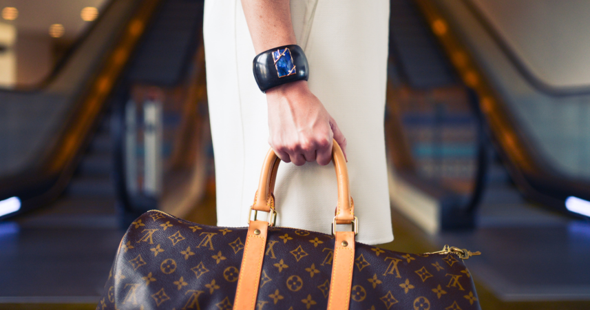
5) Louis Vuitton’s oversized monogram canvas
This one is interesting because Louis Vuitton is still one of the biggest luxury brands in the world.
Their craftsmanship is incredible. But the monogram, especially when used in large, flashy ways, has shifted from a prestige signal to something a bit louder than many modern shoppers want.
Part of this shift comes from mass visibility. When a luxury logo becomes extremely common, it loses some of its mystique. I saw a similar pattern when working with high-end spirits.
When something becomes too popular, people assume it’s more about the name than the quality.
LV still produces beautiful pieces, but the pieces people gravitate toward now tend to be the understated ones. Quiet luxury has a different kind of staying power.
6) Juicy Couture’s bedazzled graphics
There was a golden age when the Juicy tracksuit was the uniform of a generation. If you walked through any upscale mall, you’d see the logo sparkling across the backs of velour pants like a status badge.
But once the trend faded, the logo went from glamorous to kitschy. It’s a perfect example of how something can go from iconic to ironic. Juicy has been making a nostalgic comeback, but the original giant lettering still doesn’t quite hit the same way it used to.
It reminds me of certain dessert trends I’ve seen over the years. When something relies too heavily on presentation, it doesn’t always age gracefully. Subtlety leaves more room for timeless appeal.
7) The giant Ferrari horse on apparel
Most people can appreciate a beautifully engineered car. But wearing merch with a huge prancing horse across the chest doesn’t communicate refinement. It communicates something else entirely.
Ferrari itself is still a symbol of luxury and craftsmanship. The vehicles are masterpieces. But the apparel line, especially the highly branded pieces, hasn’t kept the same level of prestige.
It’s similar to when a customer would order the most expensive wine on the menu simply because it was expensive. The gesture wasn’t about taste. It was about signaling. And signaling rarely ages well.
8) The oversized Michael Kors logo
Michael Kors exploded in popularity because the brand offered accessible luxury. Their bags became an instant hit, especially the ones with prominent MK hardware. For a while, it seemed like everyone owned at least one.
But when a logo becomes the default choice for a whole demographic, people eventually move on.
Oversaturation makes even well-designed pieces feel common. Style-conscious shoppers began looking for something different, something less branded and more personal.
The brand still makes great products. But the giant MK emblem doesn’t carry the same appeal it once did. It’s a reminder that visual loudness rarely survives the test of time.
Final thoughts
Working in hospitality taught me a lot about taste. True refinement isn’t about shouting for attention. It’s about confidence, restraint, and choosing quality over noise. The same rule applies to the logos we wear.
Some of these brands still make beautiful things. The shift isn’t about the companies themselves. It’s about how culture evolves and how our personal tastes evolve with it.
What once felt impressive now feels excessive. And what feels effortless today will eventually change too. That’s the fun part of style. It’s always moving, always reinventing itself, always teaching us something about who we are becoming.
What’s Your Plant-Powered Archetype?
Ever wonder what your everyday habits say about your deeper purpose—and how they ripple out to impact the planet?
This 90-second quiz reveals the plant-powered role you’re here to play, and the tiny shift that makes it even more powerful.
12 fun questions. Instant results. Surprisingly accurate.