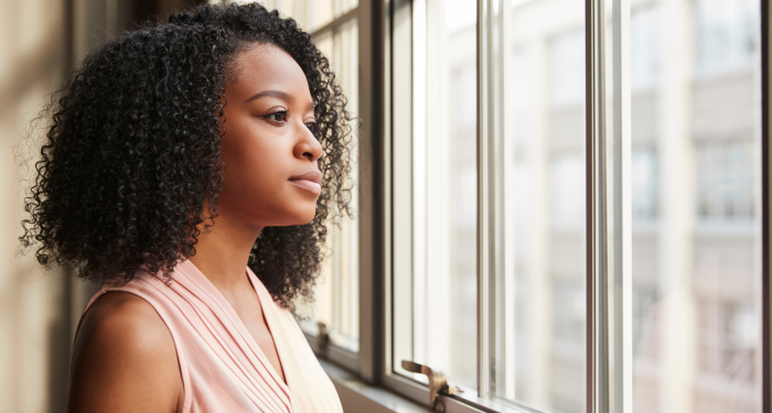
Colors aren't just visual experiences but emotional anchors, and for many of us they anchor us to memories of resilience.
![]()
Add VegOut to your Google News feed. ![]()
There's something fascinating about the way our childhood experiences shape our adult preferences.
I noticed this years ago when I was browsing through a vintage furniture store in Portland. I found myself drawn to the same earthy, muted tones over and over again. It wasn't until later that I connected the dots between those color choices and my own upbringing.
The truth is, growing up with limited financial resources leaves an imprint on us in ways we don't always recognize. One of those ways? The colors we gravitate toward as adults.
Let's explore why this happens.
1. Beige and tan
Ever wonder why some people feel instantly calm around neutral tones?
For many who grew up without much money, beige and tan represent something deeper than just a color preference. These shades were often the backdrop of childhood homes, not by choice but by necessity.
Hand-me-down furniture, affordable secondhand pieces, practical carpet choices. They all came in these neutral, forgiving shades that could hide wear and tear.
As adults, there's a subconscious comfort in these colors. They feel like home, even if home wasn't always easy. They're undemanding, quiet, and safe.
2. Forest green
Green has always been my go-to color for clothing, and I never really understood why until I started thinking about my childhood differently.
Forest green, specifically, was everywhere in working-class homes during certain decades. It was practical, it hid stains, and it was often on sale.
But there's something else at play here. As noted by color psychology research, green is associated with stability and endurance. For those who grew up watching their parents stretch every dollar, these qualities resonate on a deep level.
I've mentioned this before but colors aren't just visual experiences. They're emotional anchors. And for many of us, forest green anchors us to memories of resilience.
3. Burnt orange
Picture this: you're scrolling through home decor options online, and suddenly a burnt orange throw pillow catches your eye. You're not sure why, but you need it.
This happens more often than you'd think.
Burnt orange was a staple color in the 1970s and lingered in budget-friendly home goods well into the following decades. It was warm, it was affordable, and it showed up in everything from kitchen curtains to living room accents.
There's a nostalgic pull to this color. It reminds us of kitchens where meals were stretched to feed everyone, of living rooms where families gathered despite having little. It's a color that speaks to warmth and resourcefulness.
4. Navy blue
Do you find yourself reaching for navy blue more often than other colors?
Navy blue is the ultimate practical choice. It's professional, it's versatile, and most importantly for families on a budget, it doesn't show dirt or wear easily.
Growing up, navy blue was probably in your school uniforms, your everyday clothes, maybe even your bedding. It was chosen because it made sense, not because it was trendy.
As adults, we continue to gravitate toward it because it represents reliability. In a world that often felt uncertain, navy blue was the color that never let you down. It went with everything, lasted forever, and always looked put together.
5. Cream and off-white
Here's something interesting about cream and off-white that I learned while researching color psychology for a project last year.
These shades are different from pure white in an important way. They're softer, more forgiving, and they age more gracefully. Pure white shows every mark, every imperfection. Cream and off-white? They hide life's little accidents.
For families without much money, this mattered. White furniture or walls were a luxury that required constant upkeep. Cream was the compromise. It looked clean and fresh but didn't demand perfection.
Today, many of us still prefer these softer whites. They feel less sterile, more lived-in. They remind us that perfection isn't the goal; comfort is.
6. Burgundy or wine red
There's a richness to burgundy that makes it feel special, even luxurious.
This was exactly why it appeared so often in working-class homes. It was a way to add a touch of elegance without the price tag. A burgundy accent wall, wine-colored curtains, a deep red tablecloth for holidays.
These choices were about creating beauty within constraints. They were about refusing to let financial limitations dictate whether your home could feel warm and inviting.
I remember my grandmother's burgundy velvet armchair. It was secondhand, probably from the 1960s, but she treated it like a throne. That color represented dignity and pride, even when money was tight.
As noted by interior design experts, burgundy has historically been associated with sophistication across economic classes, making it an accessible way to elevate a space.
7. Golden yellow
Not bright, sunshine yellow. We're talking about that deeper, golden mustard tone that seemed to be everywhere in the late 20th century.
Golden yellow showed up in kitchen appliances, bathroom tiles, and living room accents. It was optimistic but grounded, cheerful but practical.
For those who grew up with limited resources, this color often represented hope. It was bright enough to lift spirits but muted enough to feel real. It didn't promise wealth or luxury; it promised warmth and possibility.
When I see this color now, I'm reminded of my mom's kitchen, where she made magic happen with whatever ingredients we had. That golden yellow was the color of making do and finding joy anyway.
8. Brown
Brown gets a bad reputation in modern design circles, but hear me out.
Brown is the color of earth, of wood, of things that last. It's the color of the sturdy furniture that survived generations, the wooden floors that bore the weight of family life, the practical shoes that had to endure.
It creates feelings of security and stability. These are precisely the feelings that those who grew up with financial constraints were seeking.
Brown wasn't glamorous, but it was honest. It represented substance over style, longevity over trends. And for many of us, that honesty is deeply comforting.
There's no judgment in being drawn to these colors. In fact, there's something beautiful about carrying these preferences forward.
The bottom line
Our color preferences aren't random.
They're shaped by our experiences, our memories, and the environments that formed us. If you grew up without much money and find yourself gravitating toward these particular shades, you're not alone.
These colors represent more than just aesthetic choices. They represent resilience, resourcefulness, and the ability to find beauty in practical places.
So the next time you're drawn to a forest green sweater or a burnt orange accent piece, remember that your preference has a story. And that story is worth honoring.
What’s Your Plant-Powered Archetype?
Ever wonder what your everyday habits say about your deeper purpose—and how they ripple out to impact the planet?
This 90-second quiz reveals the plant-powered role you’re here to play, and the tiny shift that makes it even more powerful.
12 fun questions. Instant results. Surprisingly accurate.